Multiple Choice
Figure 3.14 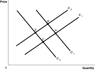 Alt text for Figure 3.14: In figure 3.14, a graph plotting intersecting demand and supply curves represents the change in equilibrium point in the apple market with the decrease in the price of a substitute fruit, orange and the increase in the wages of apple workers.
Long description for Figure 3.14: The x-axis is labelled, Quantity and the y-axis is labelled, Price.Curve D1 is a straight line which slopes down from the top left corner to the bottom right corner.Curve D2 is parallel with curve D1, but is plotted to the left.Curve S1 is a straight line which slopes up from the bottom right corner to the top left corner.Curve S2 is parallel to curve S1, but is plotted to the left.The 4 curves intersect at 4 points; A, B, on the right side of the lines, and C and D, on the left sides of the lines.
-Refer to Figure 3.14.The graph in this figure illustrates an initial competitive equilibrium in the market for apples at the intersection of D1 and S1 (point
A) The equilibrium point will move from A to E.
B) The equilibrium point will move from A to B.
C) The equilibrium point will move from A to C.
D) The equilibrium will first move from A to B, then return to A.
Correct Answer:

Verified
Correct Answer:
Verified
Q29: Assume there is a surplus in the
Q36: One would speak of a movement along
Q42: If in the market for apples the
Q149: Which of the following would shift the
Q214: "Because Coke and Pepsi are substitutes,a decrease
Q281: Table 3.5 <img src="https://d2lvgg3v3hfg70.cloudfront.net/TB3061/.jpg" alt="Table 3.5
Q282: Suppose that when the price of hamburgers
Q284: Figure 3.16 <img src="https://d2lvgg3v3hfg70.cloudfront.net/TB3061/.jpg" alt="Figure 3.16
Q286: Whether a good is normal or inferior
Q289: If provinces decide to cover part of