Multiple Choice
Figure 9.1 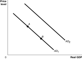 Alt text for Figure 9.1: In figure 9.1, a graph comparing real GDP and price level.
Long description for Figure 9.1: The x-axis is labelled, real GDP, and the y-axis is labelled, price level, with 0 at the vertex.Line AD1 begins in the top left corner and slopes down to the bottom center.Line AD2 follows the same slope as line AD1 but is plotted to the right.Points A and B are plotted along line AD1.Point A is a little less than half way along the left side of the line, and point B is little more than half way on the right side of the line.
-Refer to Figure 9.1.Ceteris paribus, an increase in the price level would be represented by a movement from
A) AD1 to AD2.
B) AD2 to AD1.
C) point A to point B.
D) point B to point A.
Correct Answer:

Verified
Correct Answer:
Verified
Q162: In the dynamic aggregate demand and aggregate
Q168: Which of the following correctly describes the
Q170: If full-employment GDP is equal to $1.9
Q173: Why does the short-run aggregate supply curve
Q174: Which of the following was not a
Q175: The invention of the integrated circuit by
Q176: Which of the following will shift the
Q177: Explain how each of the following events
Q193: Explain how menu costs affect the slope
Q281: An increase in disposable income will shift