Multiple Choice
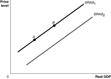
Figure 9.3  Alt text for Figure 9.3: In figure 9.3, a graph comparing real GDP and price level.
Long description for Figure 9.3: The x-axis is labelled, real GDP, with 0 at the vertex, and the y-axis is labelled, price level.2 lines are shown; SRAS1 and SRAS2.Line SRAS1 begins a little above the vertex and slopes up to the top right corner.Line SRAS2 follows the same slope as line SRAS1, but is plotted to the right.Points A and B are plotted on line SRAS1.Point A is near the left end of the line and point B is near the center of the line.
-Refer to Figure 9.3.Ceteris paribus, a decrease in the capital stock would be represented by a movement from
A) SRAS1 to SRAS2.
B) SRAS2 to SRAS1.
C) point A to point B.
D) point B to point A.
Correct Answer:

Verified
Correct Answer:
Verified
Q68: One factor which brought on the recession
Q69: The aggregate demand curve shows the relationship
Q70: An increase in aggregate demand causes an
Q71: Figure 9.1 <img src="https://d2lvgg3v3hfg70.cloudfront.net/TB3061/.jpg" alt="Figure 9.1
Q72: Figure 9.1 <img src="https://d2lvgg3v3hfg70.cloudfront.net/TB3061/.jpg" alt="Figure 9.1
Q74: The level of real GDP in the
Q75: Suppose the economy is at full employment
Q76: Using an aggregate demand graph, illustrate the
Q77: Which of the following is one reason
Q78: Because of the slope of the aggregate