Multiple Choice
Figure 9.3 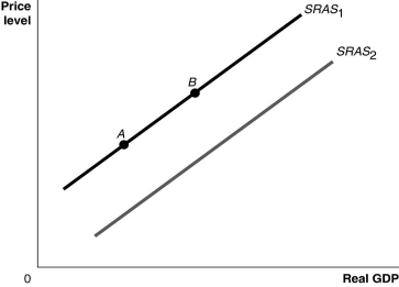 Alt text for Figure 9.3: In figure 9.3, a graph comparing real GDP and price level.
Long description for Figure 9.3: The x-axis is labelled, real GDP, with 0 at the vertex, and the y-axis is labelled, price level.2 lines are shown; SRAS1 and SRAS2.Line SRAS1 begins a little above the vertex and slopes up to the top right corner.Line SRAS2 follows the same slope as line SRAS1, but is plotted to the right.Points A and B are plotted on line SRAS1.Point A is near the left end of the line and point B is near the center of the line.
-Refer to Figure 9.3.Ceteris paribus, an increase in the expected future price level would be represented by a movement from
A) SRAS1 to SRAS2.
B) SRAS2 to SRAS1.
C) point A to point B.
D) point B to point A.
Correct Answer:

Verified
Correct Answer:
Verified
Q18: Why does the short-run aggregate supply curve
Q19: In the dynamic aggregate demand and aggregate
Q20: If, due to a recession, workers begin
Q22: An increase in the price level will<br>A)shift
Q26: How do lower income taxes affect aggregate
Q28: The _ shows the relationship between the
Q38: In the dynamic aggregate demand and aggregate
Q81: Why are the long-run effects of an
Q187: An increase in the price level shifts
Q215: Starting from long-run equilibrium,use the basic aggregate