Multiple Choice
Figure 14.3 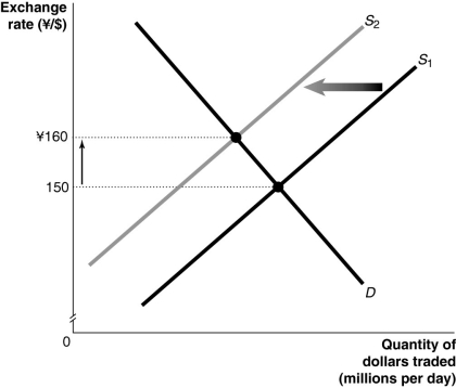 Alt text for Figure 14.3: In figure 14.3, a graph illustrates the quantity of dollars traded against the exchange rate.
Long description for Figure 14.3: The x-axis is labelled, quantity of dollars traded in millions per day, and the y-axis is labelled, exchange rate, Japanese yen against Canadian dollars, with the values 150 and 160 yen marked.2 straight line supply curves slope up from the bottom left corner to the top right corner.Supply curve D is a straight line which slopes down from the top left corner to the bottom right corner.Supply curves, S1 and S2, intersect curve D.The intersection point of S1 and D is connected to its corresponding y-axis value of 150 with a dotted line.The intersection point of S2 and D is connected to its corresponding y-axis value of 160 with a dotted line.An up pointing arrow indicates the difference between the 2 y-axis values.A left pointing arrow indicates the change from curve S1 to curve S2.
-Refer to Figure 14.3.Consider the market for Canadian dollars against the Japanese yen shown above.An event that could have caused the changes shown in the graph would be
A) an increase in Canadian real income.
B) speculators expecting the dollar to depreciate in value in the near future.
C) an economic expansion in Canada.
D) a decrease in Japanese interest rates.
E) the imposition of a tax on foreign investment in Canada.
Correct Answer:

Verified
Correct Answer:
Verified
Q157: Holding all else constant,an economic expansion in
Q189: An increase in capital inflows will<br>A)increase net
Q190: A decision by foreign central banks to
Q191: If the demand for the yen increases
Q192: An economy that does not have interactions
Q193: What two measures of macroeconomic activity are
Q195: If Ontarians increase their purchases of Italian
Q196: How would a decrease in the Canadian
Q197: Canada usually exports _ goods than it
Q199: If the balance on the current account