Essay
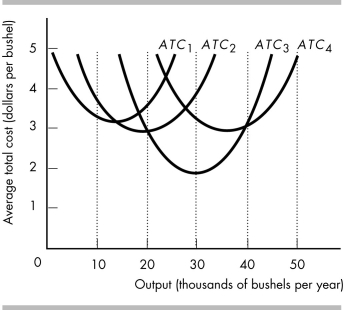
-The above figure represents the average total cost curves of a wheat farmer.
a) Which average total cost curve has the lowest average total cost of producing 30,000 bushels of wheat?
b) Over what range of output is the farmer experiencing economies of scale?
c) Over what range of output is the farmer experiencing diseconomies of scale?
d) Which average total cost curve has the lowest possible average cost of production?
e) Which average total cost curve represents the largest plant?
Correct Answer:

Verified
a) ATC3 has the lowest average total cost...View Answer
Unlock this answer now
Get Access to more Verified Answers free of charge
Correct Answer:
Verified
View Answer
Unlock this answer now
Get Access to more Verified Answers free of charge
Q358: When the demand for electricity peaks during
Q359: <img src="https://d2lvgg3v3hfg70.cloudfront.net/TB8586/.jpg" alt=" -The above table
Q360: A firm's total cost in the short
Q361: Marginal cost eventually increases because<br>A) of the
Q362: Diminishing marginal returns to labor occur because<br>A)
Q364: Decent Donuts<br> <img src="https://d2lvgg3v3hfg70.cloudfront.net/TB8586/.jpg" alt="Decent Donuts
Q365: Minneapolis business Rogue Chocolatier sells specialty chocolate
Q366: The marginal cost (MC) curve intersects the<br>A)
Q367: <img src="https://d2lvgg3v3hfg70.cloudfront.net/TB8586/.jpg" alt=" -In the above
Q368: What do economists mean when they say