Essay
Figure 10.11 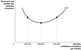
-Refer to Figure 10.11.Suppose the above graph represents the relationship between the average total cost of producing notebook computers and the quantity of notebook computers produced by Dell.On a graph, illustrate the demand, MR, MC, and ATC curves which would represent Dell maximising profits at a quantity of 100 000 per month and identify the area on the graph which represents the profit.
__________________________________________________________________________________________________________________________________________________________________________________________
Correct Answer:

Verified
Correct Answer:
Verified
Q121: Table 10.2 <img src="https://d2lvgg3v3hfg70.cloudfront.net/TB1015/.jpg" alt="Table 10.2
Q122: What does it mean if a firm
Q123: Figure 10.2<br><img src="https://d2lvgg3v3hfg70.cloudfront.net/TB1015/.jpg" alt=" Figure 10.2
Q124: Figure 10.12 <img src="https://d2lvgg3v3hfg70.cloudfront.net/TB1015/.jpg" alt="Figure 10.12
Q129: Figure 10.14 <img src="https://d2lvgg3v3hfg70.cloudfront.net/TB1015/.jpg" alt="Figure 10.14
Q130: A monopolistically competitive firm maximises profit in
Q168: If buyers of a monopolistically competitive product
Q257: Every firm that has the ability to
Q269: The reason that the coffeehouse market is
Q273: Despite being in a market with _,