menu-iconExamlexExamLexServices

Discover

Ask a Question
  1. All Topics
  2. Topic
    Business
  3. Study Set
    Microeconomics Study Set 11
  4. Exam
    Exam 4: Consumer Preferences
  5. Question
    Refer to Figure 4
Solved

Refer to Figure 4

Question 14

Question 14

Multiple Choice

Refer to Figure 4.3.Which diagram most likely represents the indifference map for a good and a "bad"?
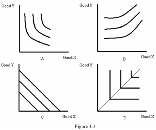
 Refer to Figure 4.3.Which diagram most likely represents the indifference map for a good and a  bad ?   A)  A B)  B C)  C D)  D


A) A
B) B
C) C
D) D

Correct Answer:

verifed

Verified

Unlock this answer now
Get Access to more Verified Answers free of charge

Related Questions

Q9: Frieda enjoys cooking and baking.Her utility function

Q10: For any given family of indifference curves,a

Q11: A "bad" would be associated with:<br>A) zero

Q12: When the more-is-better principle holds,we assign higher

Q13: Owen and Simon both like playing with

Q15: According to Figure 4.1,which of the following

Q16: Compare and contrast cardinal utility and ordinal

Q17: Higher rates of substitution are indicated by

Q18: If the more-is-better principle holds,then indifference curves

Q19: The marginal rate of substitution between two

Examlex

ExamLex

About UsContact UsPerks CenterHomeschoolingTest Prep

Work With Us

Campus RepresentativeInfluencers

Links

FaqPricingChrome Extension

Download The App

Get App StoreGet Google Play

Policies

Privacy PolicyTerms of ServiceHonor CodeCommunity Guidelines

Scan To Download

qr-code

Copyright © (2025) ExamLex LLC.

Privacy PolicyTerms Of ServiceHonor CodeCommunity Guidelines