Multiple Choice
A student was interested in the cigarette smoking habits of college students and collected data from an unbiased random sample of students. The data is summarized in the following table: 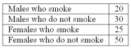 What type of chart best represents relative class frequencies?
A) Bar Chart
B) Pie Chart
C) Scatter plot
D) Frequency Polygon
Correct Answer:

Verified
Correct Answer:
Verified
Q13: A _ chart is useful for displaying
Q13: A pie chart is similar to a
Q14: To convert a frequency distribution to a
Q58: Refer to the following class marks or
Q59: The following frequency distribution shows the distribution
Q60: What is the number of observations in
Q63: Refer to the following frequency distribution on
Q67: Refer to the following frequency distribution on
Q72: A data set has 100 observations. In
Q77: In a bar chart, why are there