Multiple Choice
The diagram below shows the supply and demand diagrams for the competitive market for honey in one region.MC0 represents private marginal cost and MB0 represents private marginal benefit. 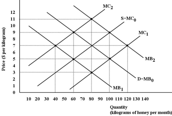 FIGURE 16-3
-Refer to Figure 16-3.Assume there are two types of firms in this region - beekeepers that produce honey and orchard keepers that produce peaches.The bees provide a benefit to the orchard keepers by pollinating their peach trees.We can say that there is a ________ externality in the production of honey.The curve ________ represents the ________ marginal benefit of honey.
A) positive; MB1; social
B) negative; MB1; private
C) negative; MB2; social
D) positive; MB2; social
E) positive; MB2; private
Correct Answer:

Verified
Correct Answer:
Verified
Q13: In a free-market economy that is continually
Q14: The efficient price to charge consumers for
Q15: The Canadian government operates a progressive personal
Q16: Consider a non-rivalrous good,like national defence,provided by
Q17: Government intervention in a particular industry is
Q19: Which of the following are characteristics of
Q20: The diagram below shows the supply and
Q21: The "informal defence" of free markets includes
Q22: A good example of a product that
Q23: Which of the following best explains why