Multiple Choice
The diagram below shows the supply and demand diagrams for the competitive market for honey in one region.MC0 represents private marginal cost and MB0 represents private marginal benefit. 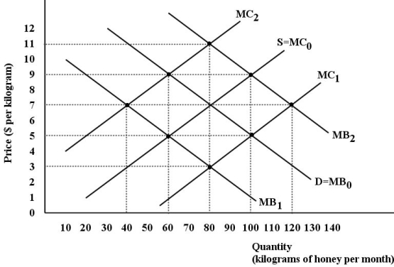 FIGURE 16-3
-Refer to Figure 16-3.Assume there are two types of firms in this region - beekeepers that produce honey and orchard keepers that produce peaches.The bees provide a benefit to the orchard keepers by pollinating their peach trees.If MB2 represents the social marginal benefit of honey,the external benefit associated with producing one unit of honey is
A) $1.
B) $2.
C) $3.
D) $4.
E) $5.
Correct Answer:

Verified
Correct Answer:
Verified
Q29: The direct resource costs of government intervention
Q30: Examples of direct costs of government intervention
Q31: The problem with externalities is essentially one
Q32: Adverse selection is said to exist when
Q33: <img src="https://d2lvgg3v3hfg70.cloudfront.net/TB5441/.jpg" alt=" FIGURE 16-1 -Refer
Q35: <img src="https://d2lvgg3v3hfg70.cloudfront.net/TB5441/.jpg" alt=" FIGURE 16-1 -Refer
Q36: The "informal defence" of free markets includes
Q37: A free-market economy with perfect allocative efficiency
Q38: Export Development Canada (EDC)provides insurance to Canadian
Q39: Why would it be inefficient for the