Multiple Choice
What does the graph below (profit/sales ratios for 25 Fortune 500 companies) reveal? 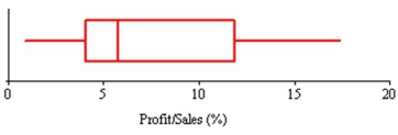
A) That the median exceeds the mean.
B) That the data are slightly left-skewed.
C) That the interquartile range is about 8.
D) That the distribution is bell-shaped.
Correct Answer:

Verified
Correct Answer:
Verified
Related Questions
Q114: Outliers are data values that fall beyond
Q115: Here are statistics on order sizes
Q116: Chebyshev's Theorem:<br>A)applies to all samples.<br>B)applies only to
Q117: If there are 19 data values, the
Q118: Given the data set 10, 5, 2,
Q120: Which is not true of the Empirical
Q121: The sum of the deviations around the
Q122: Which of the following is not a
Q123: In the following data set {7, 5,
Q124: A smooth distribution with one mode is