Multiple Choice
The following graph shows pepper prices throughout a 12-month period. 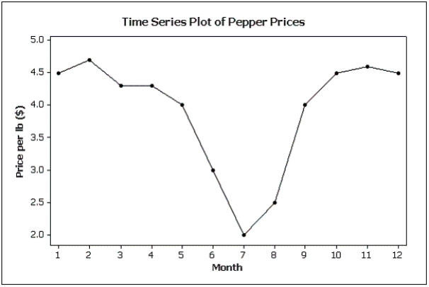 Suppose you made a new graph of the same data,where the maximum value on the Y-axis was changed from 5.0 to 10.0.(Assume everything else stays the same.) Your new graph would appear to have ____ variability in pepper prices compared to the original graph shown above.
A) more
B) less
C) the same
D) unknown
Correct Answer:

Verified
Correct Answer:
Verified
Q77: The two most important characteristics to examine
Q78: Credit Hours The College of Business at
Q79: Fifty two truck buyers were asked to
Q80: Graphical excellence is nearly always univariate.
Q81: The techniques of shrinking the horizontal axis
Q83: A modal class in a histogram is
Q84: How do you determine whether two interval
Q85: Beef prices throughout the year (month 1
Q86: Which of the following statements describes a
Q87: Possible methods of creating distorted impressions with