Multiple Choice
Figure 36-3.The left-hand graph shows a short-run aggregate-supply (SRAS) curve and two aggregate-demand (AD) curves.On the left-hand diagram,Y represents output and on the right-hand diagram,U represents the unemployment rate. 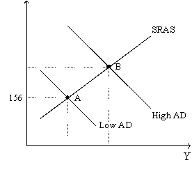
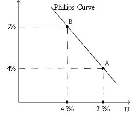
-Refer to Figure 36-3.Assume the figure charts possible outcomes for the year 2018.In 2018,the economy is at point B on the left-hand graph,which corresponds to point B on the right-hand graph.Also,point A on the left-hand graph corresponds to A on the right-hand graph.The price level in the year 2018 is
A) 155.56.
B) 159.00.
C) 163.50.
D) 170.04.
Correct Answer:

Verified
Correct Answer:
Verified
Q16: Are the effects of an increase in
Q33: Which of the following is correct if
Q47: A decrease in government expenditures serves as
Q57: Figure 36-5<br>Use the graph below to answer
Q60: Figure 36-4 <img src="https://d2lvgg3v3hfg70.cloudfront.net/TB4793/.jpg" alt="Figure 36-4
Q66: For a number of years Canada and
Q68: Other things the same, an increase in
Q118: The classical notion of monetary neutrality is
Q133: If the natural rate of unemployment falls,<br>A)both
Q190: Contractionary monetary policy<br>A)leads to disinflation and makes