Multiple Choice
The figure below shows the aggregate demand and supply curves for the U.S.The figure given below shows that between period 1 and period 2 nominal GDP changed from $40,000 to:
Figure 5.2
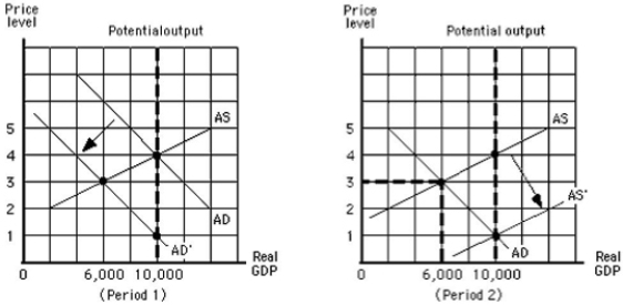
A) $18,000 and back again.
B) $18,000 and stayed there.
C) $18,000 in period 1 and to $10,000 in period 2.
D) $10,000 in period 1 and stayed there in period 2.
E) $10,000 in period 1 and to $18,000 in period 2.
Correct Answer:

Verified
Correct Answer:
Verified
Q11: The concept of "invisible hand" introduced by
Q33: The demand for _ is most severely
Q73: The term inflation is used to describe
Q104: The aggregate supply curve represents:<br>A)the quantity of
Q105: The Employment Act of 1946:<br>A)guaranteed full employment.<br>B)allowed
Q120: Which of the following is most likely
Q128: Which of these is a lagging economic
Q133: The recession that set in after December
Q139: The aggregate demand curve for an economy
Q144: Which of these is most likely to