True/False
The below figure shows the various combinations of the goods X and Y that yield different levels of utility.Figure 7.3
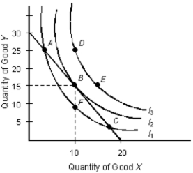
-As you move along an indifference curve, your total utility increases or decreases depending on whether it's an upward or downward movement.
Correct Answer:

Verified
Correct Answer:
Verified
Q32: The below table shows the average utility
Q33: The table given below reports the total
Q34: The below figure shows the various combinations
Q35: The table given below depicts the total
Q36: Scenario 5.1<br>The demand for noodles is given
Q38: The table below shows the total utility
Q39: The below table shows the average utility
Q40: The below table shows the average utility
Q41: The below indifference map shows the various
Q42: The table below shows the total utility