Essay
The graph below represents the market for alfalfa. The equilibrium price is $7.00 per bushel, but the market price is $9.00 per bushel. Identify the areas representing consumer surplus, producer surplus, and deadweight loss at the equilibrium price of $7.00 and at the market price of $9.00. 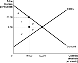
Correct Answer:

Verified
At the equilibrium price of $7.00:
Consu...View Answer
Unlock this answer now
Get Access to more Verified Answers free of charge
Correct Answer:
Verified
Consu...
View Answer
Unlock this answer now
Get Access to more Verified Answers free of charge
Q31: "Taxes are what we pay for a
Q47: Figure 4-1<br> <img src="https://d2lvgg3v3hfg70.cloudfront.net/TB4193/.jpg" alt="Figure 4-1
Q112: In cities with rent controls,the actual rents
Q118: Table 4-3<br> <img src="https://d2lvgg3v3hfg70.cloudfront.net/TB4193/.jpg" alt="Table 4-3
Q138: In a city with rent-controlled apartments, all
Q181: In Singapore the government places a $5,000
Q197: Using a supply and demand graph, illustrate
Q220: The graph below represents the market for
Q225: Figure 4-9 <img src="https://d2lvgg3v3hfg70.cloudfront.net/TB4188/.jpg" alt="Figure 4-9
Q279: Figure 4-7 <img src="https://d2lvgg3v3hfg70.cloudfront.net/TB7397/.jpg" alt="Figure 4-7