Multiple Choice
The following image shows the market equilibrium for opera tickets. The graph shows that a demand curve for opera tickets, labeled D and a supply curve of opera tickets, labeled S. Area _____ represents the maximum amount that consumers are willing to pay for 10 opera tickets?.
Figure 6.7
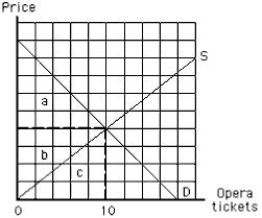
A) a
B) b
C) c
D) a + b + c
E) a + b
Correct Answer:

Verified
Correct Answer:
Verified
Q6: As long as scarcity exists, _.<br>A)product prices
Q7: The following table shows the total utility
Q11: Consumer surplus is:<br>A)the amount by which quantity
Q13: Which of the following statements is not
Q14: The following image shows the demand curve
Q49: Which of the following statements is true
Q129: Consumers must understand the economist's law of
Q136: The law of diminishing marginal utility states
Q146: Which of the following is true of
Q197: Suppose Annie allocates her income between calzones