Multiple Choice
The diagram below is a: 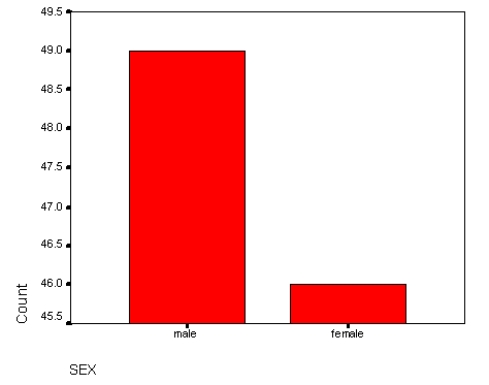
A) Mean
B) Mode
C) Bar chart
D) Frequency polygon
E) Histogram
Correct Answer:

Verified
Correct Answer:
Verified
Related Questions
Q36: The process of checking data carefully for
Q37: Which of the following would best illustrate
Q38: In which of the following can you
Q39: Histograms are used to display the distribution
Q40: Which of the following is not a
Q42: Nominal variables should be displayed on:<br>A) Bar
Q43: What measure of variability is most appropriate
Q44: In the following distribution of the variable
Q45: Consider the use of bar charts, histograms,
Q46: In distributions with an even number of