Multiple Choice
Figure 8-20
On the vertical axis of each graph,DWL is deadweight loss. 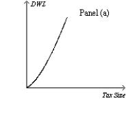
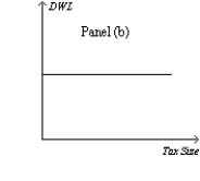
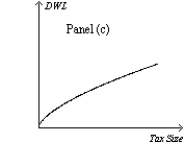
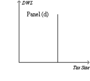
-Refer to Figure 8-20.Which graph correctly illustrates the relationship between the size of a tax and the size of the deadweight loss associated with the tax?
A) Panel (a)
B) Panel (b)
C) Panel (c)
D) Panel (d)
Correct Answer:

Verified
Correct Answer:
Verified
Q21: Figure 8-23.The figure represents the relationship between
Q22: Figure 8-21 <img src="https://d2lvgg3v3hfg70.cloudfront.net/TB2297/.jpg" alt="Figure 8-21
Q23: A decrease in the size of a
Q24: Suppose that the market for large,64-ounce soft
Q25: The higher a country's tax rates,the more
Q27: The graph that represents the amount of
Q28: Figure 8-22 <img src="https://d2lvgg3v3hfg70.cloudfront.net/TB2297/.jpg" alt="Figure 8-22
Q29: Which of the following events is consistent
Q30: With linear demand and supply curves in
Q31: Figure 8-21 <img src="https://d2lvgg3v3hfg70.cloudfront.net/TB2297/.jpg" alt="Figure 8-21