Multiple Choice
Figure 35-1.The left-hand graph shows a short-run aggregate-supply (SRAS) curve and two aggregate-demand (AD) curves.On the right-hand diagram,U represents the unemployment rate. 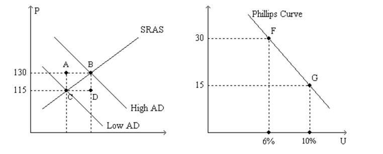
-Refer to Figure 35-1.Suppose points F and G on the right-hand graph represent two possible outcomes for an imaginary economy in the year 2012,and those two points correspond to points B and C,respectively,on the left-hand graph.Also suppose we know that the price index equaled 120 in 2011.Then the numbers 115 and 130 on the vertical axis of the left-hand graph would have to be replaced by
A) 155 and 175,respectively.
B) 138 and 156,respectively.
C) 137.5 and 154.75,respectively.
D) 135 and 150,respectively.
Correct Answer:

Verified
Correct Answer:
Verified
Q11: In the long run, policy that changes
Q53: Figure 35-1.The left-hand graph shows a short-run
Q54: Figure 35-3.The left-hand graph shows a short-run
Q55: Suppose Americans become concerned about saving for
Q56: Figure 35-1.The left-hand graph shows a short-run
Q57: Figure 35-2<br>Use the pair of diagrams below
Q60: Figure 35-4.The left-hand graph shows a short-run
Q62: Figure 35-4.The left-hand graph shows a short-run
Q63: Suppose that the money supply increases.In the
Q206: Suppose that the money supply increases. In