Multiple Choice
Figure 35-3.The left-hand graph shows a short-run aggregate-supply (SRAS) curve and two aggregate-demand (AD) curves.On the left-hand diagram,Y represents output and on the right-hand diagram,U represents the unemployment rate. 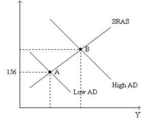
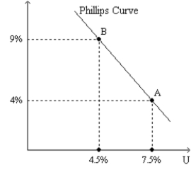
-Refer to Figure 35-3.Assume the figure depicts possible outcomes for the year 2018.In 2018,the economy is at point A on the left-hand graph,which corresponds to point A on the right-hand graph.The price level in the year 2017 was
A) 144.
B) 150.
C) 152.
D) 156.
Correct Answer:

Verified
Correct Answer:
Verified
Q46: Other things constant,which of the following would
Q47: A.W.Phillips's discovery of a particular relationship between
Q48: Suppose that the money supply decreases.In the
Q49: Figure 35-3.The left-hand graph shows a short-run
Q50: Samuelson and Solow reasoned that when aggregate
Q52: The economy will move to a point
Q53: Figure 35-1.The left-hand graph shows a short-run
Q54: Figure 35-3.The left-hand graph shows a short-run
Q55: Suppose Americans become concerned about saving for
Q56: Figure 35-1.The left-hand graph shows a short-run