Multiple Choice
Figure 35-4.The left-hand graph shows a short-run aggregate-supply (SRAS) curve and two aggregate-demand (AD) curves.On the left-hand diagram,the price level is measured on the vertical axis;on the right-hand diagram,the inflation rate is measured on the vertical axis. 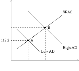
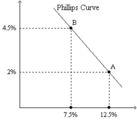
-Refer to Figure 35-4.Assume the figure depicts possible outcomes for the year 2018.In 2018,the economy is at point A on the left-hand graph,which corresponds to point A on the right-hand graph.The price level in the year 2017 was
A) 106.
B) 108.
C) 110.
D) 112.
Correct Answer:

Verified
Correct Answer:
Verified
Q75: In 2007 and 2008 households and firms
Q76: There is a<br>A)short-run tradeoff between inflation and
Q79: A.W.Phillips found a<br>A)positive relation between unemployment and
Q81: Samuelson and Solow argued that a combination
Q82: If the government raises government expenditures,then in
Q83: Figure 35-1.The left-hand graph shows a short-run
Q84: Which of the following increases inflation and
Q85: Figure 35-2<br>Use the pair of diagrams below
Q110: Suppose Congress decides to reduce government expenditures
Q162: Which of the following would we not