Multiple Choice
Figure 2-19
In the following graph the x-axis shows the number of times a commuter rail train stops at a station per hour and the y-axis shows the number of commuter rail passengers per hour.
Commuter Rail Passengers by Frequency of Service 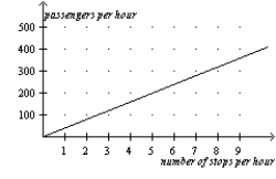
-Refer to Figure 2-19.A policymaker observes this graph and concludes that increasing the frequency of commuter rail service is a certain way to get more commuters to choose the commuter rail instead of driving their own cars.You warn the policymaker about making a reverse causality mistake with which of the following statements?
A) Higher gas prices are causing more people to choose the commuter rail over driving.
B) The service frequency was increased in response to an increase in the number of passengers per hour.
C) There is a positive relationship between frequency of stops and number of passengers.
D) None of the above is correct.
Correct Answer:

Verified
Correct Answer:
Verified
Q49: The y-coordinate of an ordered pair specifies
Q50: The use of the coordinate system allows<br>A)for
Q51: A relatively steep demand curve indicates that<br>A)quantity
Q52: When two variables move in the same
Q53: The ordered pair that represents the origin
Q55: Figure 2-18<br>Relationship between Price and Restaurant Meals
Q56: Which of the following is not held
Q57: Figure 2-17 <img src="https://d2lvgg3v3hfg70.cloudfront.net/TB2297/.jpg" alt="Figure 2-17
Q58: In the early 19th century,the Russian government
Q59: When two variables have a positive correlation,<br>A)they