Multiple Choice
The following figure shows a graph that compares the present values of two ordinary annuities of $800 quarterly as functions of the number of quarters. One annuity is at an annual rate of 6% compounded quarterly, and the other is at an annual rate of 9% compounded quarterly. Use the graph below to estimate the difference between the present values of these annuities for 25 years (100 quarters) .
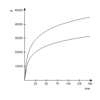
A) $36,000
B) $4,800
C) $30,000
D) $125
E) $9,586
Correct Answer:

Verified
Correct Answer:
Verified
Q16: Find the present value of an annuity
Q80: State whether the problem relates to an
Q92: What interest will be earned if $5,800
Q98: Given 10 and 30 year loans with
Q99: Suppose Becky has her choice of $10,000
Q101: If you borrow $1,400 for 6 years
Q102: A woman buys an apartment house for
Q105: An annuity consists of payments of $600
Q122: Suppose Emily Yu deposited $1,400 in an
Q127: Suppose that in order to buy a