Multiple Choice
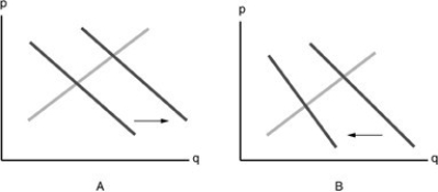
-Refer to the above figure for the market of Cheerios. Which diagram depicts the effect of an increase in the price of Cheerios?
A) A
B) B
C) neither graph
D) both graphs
Correct Answer:

Verified
Correct Answer:
Verified
Related Questions
Q202: When the price of a good falls,
Q203: The market demand curve for a particular
Q204: The demand curve shows the relationship between
Q205: Suppliers will provide more of a good
Q206: Scalping activity arises when<br>A) the prices of
Q208: If bagels and croissants are substitute goods,
Q209: When the price of TVs goes up
Q210: Demand is a schedule of<br>A) how much
Q211: A market demand schedule for a product
Q212: At the market clearing price<br>A) there is