Multiple Choice
Figure 17-3. The left-hand graph shows a short-run aggregate-supply (SRAS) curve and two aggregate-demand (AD) curves. On the left-hand diagram, Y represents output and on the right-hand diagram, U represents the unemployment rate.
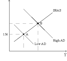
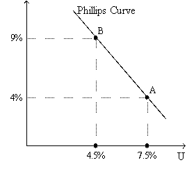
-Refer to Figure 17-3. Assume the figure charts possible outcomes for the year 2018. In 2018, the economy is at point B on the left-hand graph, which corresponds to point B on the right-hand graph. Also, point A on the left-hand graph corresponds to A on the right-hand graph. The price level in the year 2018 is
A) 155.56.
B) 159.00.
C) 163.50.
D) 170.04.
Correct Answer:

Verified
Correct Answer:
Verified
Q10: If the long-run Phillips curve shifts to
Q14: The economy is in long-run equilibrium when
Q21: As the aggregate demand curve shifts leftward
Q29: Disinflation is like<br>A)slowing a car down,whereas deflation
Q32: The short-run Phillips curve shows the combinations
Q55: Which of the following is downward-sloping?<br>A)both the
Q70: If policymakers increase aggregate demand,then in the
Q111: If expected inflation increases,which of the following
Q144: Suppose that the central bank unexpectedly increases
Q164: Samuelson and Solow believed that the Phillips