Multiple Choice
Based on the chart, what was the interquartile range of marks (approximately) . 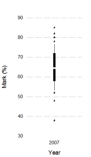
A) 7%
B) 22%
C) 47%
D) 14%
Correct Answer:

Verified
Correct Answer:
Verified
Related Questions
Q1: Imagine we took a group of smokers,
Q2: What is this graph known as? <img
Q4: Approximately what is the median success score
Q5: Which of the following statements best describes
Q6: Looking at the graph below, which intervention
Q7: What does the graph below show? <img
Q8: We took a sample of children who
Q9: What can we say about the graph
Q10: In IBM SPSS, what is this graph
Q11: Looking at the graph below, approximately what