Essay
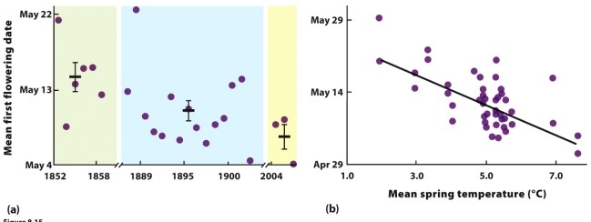
-The data in the figure show a relationship between the mean flowering date for many plant species around Concord, New Hampshire, in the United States, and the mean spring temperature over a time span exceeding 150 years. However, there is a lot of scatter around the best-fit line in panel
b. What information in the chapter might suggest the source of this scatter, and what does it imply about the plant species' cues for flowering?
Correct Answer:

Verified
The scatter in the data could be due to ...View Answer
Unlock this answer now
Get Access to more Verified Answers free of charge
Correct Answer:
Verified
View Answer
Unlock this answer now
Get Access to more Verified Answers free of charge
Q2: Which life history type, fast or slow,
Q6: Some marine snails (species L) produce large
Q7: Explain why life history variables, such as
Q8: Topic: the effects of resources<br>Difficulty: medium<br>Research on
Q14: Is senescence inevitable? Please explain your answer,
Q25: Which life history type do mammals exhibit?<br>A)
Q29: The principle of allocation states that life
Q35: Which of the following does NOT apply
Q45: Tropical songbirds tend to lay fewer eggs
Q58: Explain two significant ways in which environmental