Multiple Choice
The two graphs show the change in allele frequency, p, over 100 generations. Each graph shows 10 different populations, all experiencing the same evolutionary forces. What is the most likely difference between the populations shown in the top graph compared to the populations in the bottom graph? 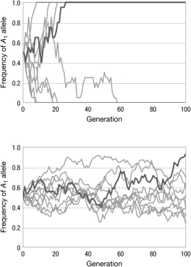
A) There is no difference between the populations; the differences in the graphs are due to chance.
B) The populations in the graph on top have a longer generation time than the populations in the bottom graph.
C) The populations in the graph on top are experiencing genetic drift; the populations in the graph on bottom are experiencing directional selection.
D) The population sizes in the graph on top are smaller than the population sizes in the graph on the bottom.
Correct Answer:

Verified
Correct Answer:
Verified
Q24: Consider a population of size N<sub>e</sub> with
Q25: Which of the following is an example
Q26: The solution to the puzzle of why
Q27: When both drift and selection are acting
Q28: The figure shows the relationship between the
Q30: A new mutation arises in a population
Q31: Imagine an island archipelago where all of
Q32: Population bottlenecks can result in rapid fixation
Q33: A population of fruit flies was maintained
Q34: Which of the following is true of