Essay
The graphs show the results of simulations of changes in the frequency of a neutral allele. Each graph shows 10 different runs of the simulation. What is the most likely difference between these simulations? Explain your reasoning. A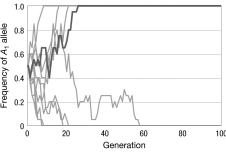
B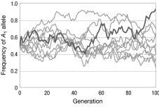
C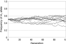
Correct Answer:

Verified
Graph A has the smallest population size...View Answer
Unlock this answer now
Get Access to more Verified Answers free of charge
Correct Answer:
Verified
View Answer
Unlock this answer now
Get Access to more Verified Answers free of charge
Q9: Consider a population of lizards living on
Q10: Consider a series of island populations each
Q11: A rancher genotypes all of her 150
Q12: In the figure, assuming all evolutionary processes
Q13: Why might a wind-pollinated plant experience different
Q15: Explain why the probability of fixation of
Q16: Consider two species, 1 and 2, that
Q17: If neutral mutations occur at the rate
Q18: In a diploid population, the threshold at
Q19: Refer to the figure of the genetic