Multiple Choice
The figure shows the change in allele frequencies over many generations. What differs between the populations represented by the three colors? 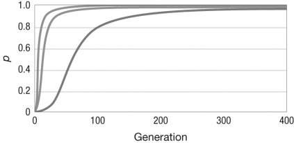
A) the strength of selection
B) whether the allele is dominant or recessive
C) the population size
D) whether selection is frequency dependent or frequency independent
Correct Answer:

Verified
Correct Answer:
Verified
Q16: What are the effects of natural selection,
Q17: Consider a locus with two alleles in
Q18: Why is underdominance so rare in natural
Q19: Consider a locus with two alleles, A
Q20: Population sex ratios, that is, how many
Q22: Proponents of eugenics sought to eliminate alleles
Q23: Which of the following processes will result
Q24: Consider a locus with two alleles, A
Q25: The Hardy-Weinberg model assumes that none of
Q26: Which of the following genotypic fitness values