Multiple Choice
What does the graph below (profit/sales ratios for 25 Fortune 500 companies) reveal? 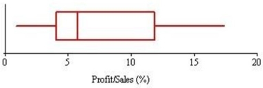
A) That the median exceeds the mean.
B) That the data are slightly left-skewed.
C) That the interquartile range is about 8.
D) That the distribution is bell-shaped.
Correct Answer:

Verified
Correct Answer:
Verified
Related Questions
Q3: Which is true of skewness?<br>A)In business data,
Q8: A trimmed mean may be preferable to
Q33: It is inappropriate to apply the Empirical
Q34: Eleven students were asked how many siblings
Q38: The midhinge lies halfway between<br>A)xmin and xmax.<br>B)Q1
Q40: If the standard deviations of two samples
Q41: The 25th percentile for waiting time in
Q49: Three randomly chosen Colorado students were asked
Q109: In a sample of 10,000 observations from
Q125: Given the data set 2, 5, 10,