Multiple Choice
What does the graph below (profit/sales ratios for 25 Fortune 500 companies) reveal? 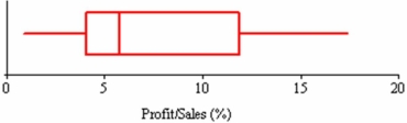
A) That the median exceeds the mean.
B) That the data are slightly left-skewed.
C) That the interquartile range is about 8.
D) That the distribution is bell-shaped.
Correct Answer:

Verified
Correct Answer:
Verified
Related Questions
Q2: In Tokyo, construction workers earn an average
Q59: Exam scores in a random sample of
Q62: Which is a characteristic of the standard
Q73: The midhinge is a robust measure of
Q75: Patient waiting times in the Tardis Orthopedic
Q77: The range as a measure of variability
Q95: A sample of 50 breakfast customers of
Q99: Here are advertised prices of 21 used
Q132: Which of the following statements is likely
Q142: Which is true of the kurtosis of