Multiple Choice
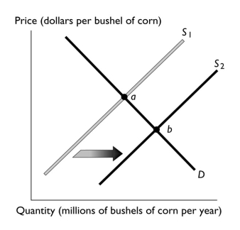
-The above figure illustrates the market for corn.If point "a" represents the original equilibrium and point "b" the new equilibrium,which of the following could have caused the change?
A) an increase in the number of corn growers
B) an increase the price of wheat, a substitute in production for corn
C) an increase in the cost of the fertilizer used to grow the corn
D) a belief among corn farmers that the price of a bushel of corn will be higher next month
E) an increase in income if corn is a normal good
Correct Answer:

Verified
Correct Answer:
Verified
Q320: Candy makers accurately anticipate the increase in
Q321: If the automobile workers' union successfully negotiates
Q322: Millions of people from Mexico have migrated
Q323: Suppose that the price of bread rises.This
Q324: Why does an increase in supply lead
Q326: <img src="https://d2lvgg3v3hfg70.cloudfront.net/TB1458/.jpg" alt=" -The table above
Q327: To find the market demand curve for
Q328: Market equilibrium<br>i.can never occur because there are
Q329: An increase in the equilibrium price and
Q330: When a surplus of rice occurs,<br>A) the