Multiple Choice
The following table shows the number of payroll jobs the government added during the years it added jobs (since 1973) .The jobs are in thousands. 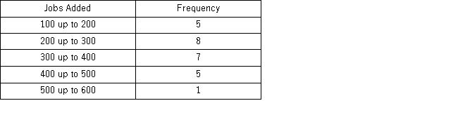 Approximately what percent of the time did the government add 200,000 or more jobs?
A) 19%
B) 50%
C) 77%
D) 81%
Correct Answer:

Verified
Correct Answer:
Verified
Q12: When summarizing quantitative data it is always
Q21: In order to summarize qualitative data, a
Q21: The following histogram represents the number of
Q23: The following data represent the ages of
Q24: The following table shows the prices (in
Q27: A histogram is a series of rectangles
Q28: For which of the following data sets
Q29: The following frequency distribution displays the weekly
Q73: Horizontal bar charts are constructed by placing
Q110: A pie chart is a segmented circle