Deck 2: Descriptive Statistics and Analytics: Tabular and Graphical Methods
Full screen (f)
Question
Question
Question
Question
Question
Question
Question
Question
Question
Question
Question
Question
Question
Question
Question
Question
Question
Question
Question
Question
Question
Question
Question
Question
Question
Question
Question
Question
Question
Question
Question
Question
Question
Question
Question
Question
Question
Question
Question
Question
Question
Question
Question
Question
Question
Question
A CFO is looking at what percentage of a company's resources are spent on computing. He samples companies in the pharmaceutical industry and develops the following stem-and-leaf display (leaf unit = 0.1). 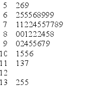 If you were creating a frequency histogram using these data, how many classes would you create?
A) 4
B) 5
C) 6
D) 7
E) 8
If you were creating a frequency histogram using these data, how many classes would you create?A) 4
B) 5
C) 6
D) 7
E) 8
Question
A CFO is looking at what percentage of a company's resources are spent on computing. He samples companies in the pharmaceutical industry and develops the following stem-and-leaf display (leaf unit = 0.1).  What is the smallest percentage spent on R&D?
A) 5.9
B) 5.6
C) 5.2
D) 5.02
E) 50.2
What is the smallest percentage spent on R&D?A) 5.9
B) 5.6
C) 5.2
D) 5.02
E) 50.2
Question
Question
Question
Question
Question
Question
Question
Question
Question
A CFO is looking at what percentage of a company's resources are spent on computing. He samples companies in the pharmaceutical industry and develops the following stem-and-leaf display (leaf unit = 0.1).  What is the approximate shape of the distribution of the data?
A) normal
B) skewed to the right
C) skewed to the left
D) bimodal
E) uniform
What is the approximate shape of the distribution of the data?A) normal
B) skewed to the right
C) skewed to the left
D) bimodal
E) uniform
Question
Question
Question
Question
Question
Question
A CFO is looking at what percentage of a company's resources are spent on computing. He samples companies in the pharmaceutical industry and develops the following stem-and-leaf display (leaf unit = 0.1).  What would be the class length used in creating a frequency histogram?
A) 1.4
B) 8.3
C) 1.2
D) 1.7
E) 0.9
What would be the class length used in creating a frequency histogram?A) 1.4
B) 8.3
C) 1.2
D) 1.7
E) 0.9
Question
Question
A company's Chief Operating Officer (COO) keeps track of the mileage on her trips from her office at corporate headquarters to the company's off-site manufacturing facility and its nearby suppliers. The stem-and-leaf display of the data for one year is below.  What would be the class length for creating the frequency histogram?
A) 14
B) 9
C) 27
D) 18
E) 23
What would be the class length for creating the frequency histogram?A) 14
B) 9
C) 27
D) 18
E) 23
Question
A CFO is looking at what percentage of a company's resources are spent on computing. He samples companies in the pharmaceutical industry and develops the following stem-and-leaf display (leaf unit = 0.1).  What would be the first class interval for the frequency histogram?
A) 5.2 < 6.6
B) 5.2 < 6.0
C) 5.0 < 6.0
D) 5.0 < 6.4
E) 5.2 < 6.4
What would be the first class interval for the frequency histogram?A) 5.2 < 6.6
B) 5.2 < 6.0
C) 5.0 < 6.0
D) 5.0 < 6.4
E) 5.2 < 6.4
Question
Question
A company collected the ages from a random sample of its middle managers, with the resulting frequency distribution shown below.  What is the midpoint of the third class interval?
A) 22.5
B) 27.5
C) 32.5
D) 37.5
E) 42.5
What is the midpoint of the third class interval?A) 22.5
B) 27.5
C) 32.5
D) 37.5
E) 42.5
Question
Question
Question
At the end of their final exam, 550 students answered an additional question in which they rated their instructor's teaching effectiveness, with the following results.  What proportion of the students who rated their instructor as very or somewhat effective received a B or better in the class?
A) 0.345
B) 0.254
C) 0.482
D) 0.898
E) 0.644
What proportion of the students who rated their instructor as very or somewhat effective received a B or better in the class?A) 0.345
B) 0.254
C) 0.482
D) 0.898
E) 0.644
Question
Question
Question
Question
A company's Chief Operating Officer (COO) keeps track of the mileage on her trips from her office at corporate headquarters to the company's off-site manufacturing facility and its nearby suppliers. The stem-and-leaf display of the data for one year is below.  How many trips were used in this display?
A) 7
B) 9
C) 10
D) 11
E) 12
How many trips were used in this display?A) 7
B) 9
C) 10
D) 11
E) 12
Question
Question
Question
A company collected the ages from a random sample of its middle managers, with the resulting frequency distribution shown below.  What would be the approximate shape of the relative frequency histogram?
A) symmetrical
B) uniform
C) linear
D) skewed to the left
E) skewed to the right
What would be the approximate shape of the relative frequency histogram?A) symmetrical
B) uniform
C) linear
D) skewed to the left
E) skewed to the right
Question
Question
A company collected the ages from a random sample of its middle managers, with the resulting frequency distribution shown below. 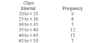 What is the relative frequency for the class with the greatest frequency?
A) .132
B) .226
C) .231
D) .283
E) .288
What is the relative frequency for the class with the greatest frequency?A) .132
B) .226
C) .231
D) .283
E) .288
Question
A company's Chief Operating Officer (COO) keeps track of the mileage on her trips from her office at corporate headquarters to the company's off-site manufacturing facility and its nearby suppliers. The stem-and-leaf display of the data for one year is below.  In developing a histogram of these data, how many classes would be used?
A) 4
B) 5
C) 6
D) 7
E) 8
In developing a histogram of these data, how many classes would be used?A) 4
B) 5
C) 6
D) 7
E) 8

Unlock Deck
Sign up to unlock the cards in this deck!
Unlock Deck
Unlock Deck
1/120
Play
Full screen (f)
Deck 2: Descriptive Statistics and Analytics: Tabular and Graphical Methods
1
A scatter plot can be used to identify outliers.
False
2
Beginning the vertical scale of a graph at a value different from zero can cause increases to look more dramatic.
True
3
The relative frequency is the frequency of a class divided by the total number of measurements.
True
4
A runs plot is a form of scatter plot.
Unlock Deck
Unlock for access to all 120 flashcards in this deck.
Unlock Deck
k this deck
5
The stem-and-leaf display is advantageous because it allows us to actually see the measurements in the data set.
Unlock Deck
Unlock for access to all 120 flashcards in this deck.
Unlock Deck
k this deck
6
Stem-and-leaf displays and dot plots are useful for detecting outliers.
Unlock Deck
Unlock for access to all 120 flashcards in this deck.
Unlock Deck
k this deck
7
When we wish to summarize the proportion (or fraction) of items in a class, we use the frequency distribution for each class.
Unlock Deck
Unlock for access to all 120 flashcards in this deck.
Unlock Deck
k this deck
8
When establishing the classes for a frequency distribution, it is generally agreed that the more classes you use the better your frequency distribution will be.
Unlock Deck
Unlock for access to all 120 flashcards in this deck.
Unlock Deck
k this deck
9
It is possible to create different interpretations of the same graphical display by simply using different captions.
Unlock Deck
Unlock for access to all 120 flashcards in this deck.
Unlock Deck
k this deck
10
Each stem of a stem-and-leaf display should be a single digit.
Unlock Deck
Unlock for access to all 120 flashcards in this deck.
Unlock Deck
k this deck
11
The cumulative frequency for a class will always be at least as large as the cumulative frequency for any class with a smaller upper boundary.
Unlock Deck
Unlock for access to all 120 flashcards in this deck.
Unlock Deck
k this deck
12
A frequency table includes row and column percentages.
Unlock Deck
Unlock for access to all 120 flashcards in this deck.
Unlock Deck
k this deck
13
When constructing a graphical display that utilizes categorical data, classes that have frequencies of 5 percent or less are usually combined together into a single category.
Unlock Deck
Unlock for access to all 120 flashcards in this deck.
Unlock Deck
k this deck
14
In a Pareto chart, the bar for the "Other" category should be placed to the far left of the chart.
Unlock Deck
Unlock for access to all 120 flashcards in this deck.
Unlock Deck
k this deck
15
In the first step of setting up a Pareto chart, a frequency table should be constructed of the defects (or categories) in decreasing order of frequency.
Unlock Deck
Unlock for access to all 120 flashcards in this deck.
Unlock Deck
k this deck
16
Splitting the stems refers to assigning the same stem to two or more rows of the stem-and-leaf display.
Unlock Deck
Unlock for access to all 120 flashcards in this deck.
Unlock Deck
k this deck
17
A stem-and-leaf display is a graphical portrayal of a data set that shows the data set's overall pattern of variation.
Unlock Deck
Unlock for access to all 120 flashcards in this deck.
Unlock Deck
k this deck
18
When data are qualitative, the bars should never be separated by gaps.
Unlock Deck
Unlock for access to all 120 flashcards in this deck.
Unlock Deck
k this deck
19
A bar chart is a graphic that can be used to depict qualitative data.
Unlock Deck
Unlock for access to all 120 flashcards in this deck.
Unlock Deck
k this deck
20
When looking at the shape of the distribution using a histogram, a distribution is skewed to the right when the left tail is shorter than the right tail.
Unlock Deck
Unlock for access to all 120 flashcards in this deck.
Unlock Deck
k this deck
21
Leaves on a stem-and-leaf display should be rearranged so that they are in increasing order from left to right.
Unlock Deck
Unlock for access to all 120 flashcards in this deck.
Unlock Deck
k this deck
22
Sparklines always need to be displayed with either their axes or coordinates.
Unlock Deck
Unlock for access to all 120 flashcards in this deck.
Unlock Deck
k this deck
23
Sparklines are line charts and are often embedded with the text where they are being discussed.
Unlock Deck
Unlock for access to all 120 flashcards in this deck.
Unlock Deck
k this deck
24
An analytic dashboard presents both current and historical trends of a business's key performance indicators.
Unlock Deck
Unlock for access to all 120 flashcards in this deck.
Unlock Deck
k this deck
25
Which of the following is not a graphical tool for descriptive analytics (dashboards)?
A) bullet graph
B) sparkline
C) raw data
D) treemap
E) gauge
A) bullet graph
B) sparkline
C) raw data
D) treemap
E) gauge
Unlock Deck
Unlock for access to all 120 flashcards in this deck.
Unlock Deck
k this deck
26
Treemaps are used to compare multiple stem-and-leaf diagrams.
Unlock Deck
Unlock for access to all 120 flashcards in this deck.
Unlock Deck
k this deck
27
Row or column percentages can be found in
A) frequency tables.
B) relative frequency tables.
C) cross-tabulation tables.
D) cumulative frequency tables.
A) frequency tables.
B) relative frequency tables.
C) cross-tabulation tables.
D) cumulative frequency tables.
Unlock Deck
Unlock for access to all 120 flashcards in this deck.
Unlock Deck
k this deck
28
Key performance indicators are best represented by a data discovery method.
Unlock Deck
Unlock for access to all 120 flashcards in this deck.
Unlock Deck
k this deck
29
All of the following are used to describe quantitative data except the ________.
A) histogram
B) stem-and-leaf chart
C) dot plot
D) pie chart
A) histogram
B) stem-and-leaf chart
C) dot plot
D) pie chart
Unlock Deck
Unlock for access to all 120 flashcards in this deck.
Unlock Deck
k this deck
30
A(n) ________ is a graph of a cumulative distribution.
A) histogram
B) scatter plot
C) ogive
D) pie chart
A) histogram
B) scatter plot
C) ogive
D) pie chart
Unlock Deck
Unlock for access to all 120 flashcards in this deck.
Unlock Deck
k this deck
31
Gauges feature a single measure showing variation over time.
Unlock Deck
Unlock for access to all 120 flashcards in this deck.
Unlock Deck
k this deck
32
Which of the following tools used by graphical descriptive analytics will show variation over time?
A) bullet graph
B) sparkline
C) treemap
D) gauge
A) bullet graph
B) sparkline
C) treemap
D) gauge
Unlock Deck
Unlock for access to all 120 flashcards in this deck.
Unlock Deck
k this deck
33
If space is an issue when presenting analytic dashboard graphics, gauges should be used most frequently.
Unlock Deck
Unlock for access to all 120 flashcards in this deck.
Unlock Deck
k this deck
34
A bullet graph features a single measure and displays it as either a horizontal or vertical bar.
Unlock Deck
Unlock for access to all 120 flashcards in this deck.
Unlock Deck
k this deck
35
________ can be used to study the relationship between two variables.
A) Cross-tabulation tables
B) Frequency tables
C) Cumulative frequency distributions
D) Dot plots
A) Cross-tabulation tables
B) Frequency tables
C) Cumulative frequency distributions
D) Dot plots
Unlock Deck
Unlock for access to all 120 flashcards in this deck.
Unlock Deck
k this deck
36
As a business owner, I have requested my staff to develop a set of dashboards that can be used by the public to show wait time at each of my four local coffee shops at peak times during the day and whether the time is short, medium, or long. Which of the following graphical displays would be the best choice?
A) bullet graph
B) sparkline
C) treemap
D) gauges
A) bullet graph
B) sparkline
C) treemap
D) gauges
Unlock Deck
Unlock for access to all 120 flashcards in this deck.
Unlock Deck
k this deck
37
A treemap displays information as a series of clustered rectangles.
Unlock Deck
Unlock for access to all 120 flashcards in this deck.
Unlock Deck
k this deck
38
Which of the following is the best analytic dashboard graphical method for visualizing hierarchical information?
A) bullet graph
B) sparkline
C) treemap
D) gauge
A) bullet graph
B) sparkline
C) treemap
D) gauge
Unlock Deck
Unlock for access to all 120 flashcards in this deck.
Unlock Deck
k this deck
39
A(n) ________ is a graphical presentation of the current status and historical trends of a business's key performance indicators.
A) frequency distribution
B) histogram
C) Pareto chart
D) dashboard
A) frequency distribution
B) histogram
C) Pareto chart
D) dashboard
Unlock Deck
Unlock for access to all 120 flashcards in this deck.
Unlock Deck
k this deck
40
Data drill down is a form of data discovery.
Unlock Deck
Unlock for access to all 120 flashcards in this deck.
Unlock Deck
k this deck
41
If there are 130 values in a data set, how many classes should be created for a frequency histogram?
A) 4
B) 5
C) 6
D) 7
E) 8
A) 4
B) 5
C) 6
D) 7
E) 8
Unlock Deck
Unlock for access to all 120 flashcards in this deck.
Unlock Deck
k this deck
42
An unusually large or small observation separated from the rest of the data is a(n) ________.
A) absolute extreme
B) outlier
C) mode
D) quartile
A) absolute extreme
B) outlier
C) mode
D) quartile
Unlock Deck
Unlock for access to all 120 flashcards in this deck.
Unlock Deck
k this deck
43
A(n) ________ can be used to differentiate the "vital few" causes of quality problems from the "trivial many" causes of quality problems.
A) histogram
B) scatter plot
C) pareto chart
D) ogive plot
E) stem-and-leaf display
A) histogram
B) scatter plot
C) pareto chart
D) ogive plot
E) stem-and-leaf display
Unlock Deck
Unlock for access to all 120 flashcards in this deck.
Unlock Deck
k this deck
44
When developing a frequency distribution, the class (group) intervals must be ________.
A) large
B) small
C) integer
D) nonoverlapping
E) equal
A) large
B) small
C) integer
D) nonoverlapping
E) equal
Unlock Deck
Unlock for access to all 120 flashcards in this deck.
Unlock Deck
k this deck
45
________ and ________ are used to describe qualitative (categorical) data.
A) Stem-and-leaf displays; scatter plots
B) Scatter plots; histograms
C) Dot plots; bar charts
D) Bar charts; pie charts
E) Pie charts; histograms
A) Stem-and-leaf displays; scatter plots
B) Scatter plots; histograms
C) Dot plots; bar charts
D) Bar charts; pie charts
E) Pie charts; histograms
Unlock Deck
Unlock for access to all 120 flashcards in this deck.
Unlock Deck
k this deck
46
A CFO is looking at what percentage of a company's resources are spent on computing. He samples companies in the pharmaceutical industry and develops the following stem-and-leaf display (leaf unit = 0.1). If you were creating a frequency histogram using these data, how many classes would you create?
A) 4
B) 5
C) 6
D) 7
E) 8
If you were creating a frequency histogram using these data, how many classes would you create?A) 4
B) 5
C) 6
D) 7
E) 8
Unlock Deck
Unlock for access to all 120 flashcards in this deck.
Unlock Deck
k this deck
47
A CFO is looking at what percentage of a company's resources are spent on computing. He samples companies in the pharmaceutical industry and develops the following stem-and-leaf display (leaf unit = 0.1). What is the smallest percentage spent on R&D?
A) 5.9
B) 5.6
C) 5.2
D) 5.02
E) 50.2
What is the smallest percentage spent on R&D?A) 5.9
B) 5.6
C) 5.2
D) 5.02
E) 50.2
Unlock Deck
Unlock for access to all 120 flashcards in this deck.
Unlock Deck
k this deck
48
Which of the following graphical tools is not used to study the shapes of distributions?
A) stem-and-leaf display
B) scatter plot
C) histogram
D) dot plot
A) stem-and-leaf display
B) scatter plot
C) histogram
D) dot plot
Unlock Deck
Unlock for access to all 120 flashcards in this deck.
Unlock Deck
k this deck
49
All of the following are used to describe qualitative data except the ________.
A) bar chart
B) pie chart
C) histogram
D) Pareto chart
A) bar chart
B) pie chart
C) histogram
D) Pareto chart
Unlock Deck
Unlock for access to all 120 flashcards in this deck.
Unlock Deck
k this deck
50
A stem-and-leaf display is best used to ________.
A) provide a point estimate of the variability of the data set
B) provide a point estimate of the central tendency of the data set
C) display the shape of the distribution
D) display a two-variable treemap
A) provide a point estimate of the variability of the data set
B) provide a point estimate of the central tendency of the data set
C) display the shape of the distribution
D) display a two-variable treemap
Unlock Deck
Unlock for access to all 120 flashcards in this deck.
Unlock Deck
k this deck
51
A ________ displays the frequency of each class with qualitative data and a ________ displays the frequency of each class with quantitative data.
A) histogram; stem-and-leaf display
B) bar chart; histogram
C) scatter plot; bar chart
D) stem-and-leaf; pie chart
A) histogram; stem-and-leaf display
B) bar chart; histogram
C) scatter plot; bar chart
D) stem-and-leaf; pie chart
Unlock Deck
Unlock for access to all 120 flashcards in this deck.
Unlock Deck
k this deck
52
If there are 62 values in a data set, how many classes should be created for a frequency histogram?
A) 4
B) 5
C) 6
D) 7
E) 8
A) 4
B) 5
C) 6
D) 7
E) 8
Unlock Deck
Unlock for access to all 120 flashcards in this deck.
Unlock Deck
k this deck
53
Which of the following divides quantitative measurements into classes and graphs the frequency, relative frequency, or percentage frequency for each class?
A) histogram
B) dot plot
C) stem-and-leaf display
D) scatter plot
A) histogram
B) dot plot
C) stem-and-leaf display
D) scatter plot
Unlock Deck
Unlock for access to all 120 flashcards in this deck.
Unlock Deck
k this deck
54
If there are 30 values in a data set, how many classes should be created for a frequency histogram?
A) 4
B) 5
C) 6
D) 7
E) 8
A) 4
B) 5
C) 6
D) 7
E) 8
Unlock Deck
Unlock for access to all 120 flashcards in this deck.
Unlock Deck
k this deck
55
Which of the following graphs is for qualitative data?
A) histogram
B) bar chart
C) ogive plot
D) stem-and-leaf
A) histogram
B) bar chart
C) ogive plot
D) stem-and-leaf
Unlock Deck
Unlock for access to all 120 flashcards in this deck.
Unlock Deck
k this deck
56
A CFO is looking at what percentage of a company's resources are spent on computing. He samples companies in the pharmaceutical industry and develops the following stem-and-leaf display (leaf unit = 0.1). What is the approximate shape of the distribution of the data?
A) normal
B) skewed to the right
C) skewed to the left
D) bimodal
E) uniform
What is the approximate shape of the distribution of the data?A) normal
B) skewed to the right
C) skewed to the left
D) bimodal
E) uniform
Unlock Deck
Unlock for access to all 120 flashcards in this deck.
Unlock Deck
k this deck
57
Which one of the following graphical tools is used with quantitative data?
A) bar chart
B) histogram
C) pie chart
D) Pareto chart
A) bar chart
B) histogram
C) pie chart
D) Pareto chart
Unlock Deck
Unlock for access to all 120 flashcards in this deck.
Unlock Deck
k this deck
58
A plot that allows us to visualize the relationship between two variables is a(n) ________ plot.
A) frequency
B) scatter
C) dot
D) ogive
A) frequency
B) scatter
C) dot
D) ogive
Unlock Deck
Unlock for access to all 120 flashcards in this deck.
Unlock Deck
k this deck
59
If there are 120 values in a data set, how many classes should be created for a frequency histogram?
A) 4
B) 5
C) 6
D) 7
E) 8
A) 4
B) 5
C) 6
D) 7
E) 8
Unlock Deck
Unlock for access to all 120 flashcards in this deck.
Unlock Deck
k this deck
60
A ________ shows the relationship between two variables.
A) stem-and-leaf
B) bar chart
C) histogram
D) scatter plot
E) pie chart
A) stem-and-leaf
B) bar chart
C) histogram
D) scatter plot
E) pie chart
Unlock Deck
Unlock for access to all 120 flashcards in this deck.
Unlock Deck
k this deck
61
A histogram that has a longer tail extending toward larger values is ________.
A) skewed to the left
B) normal
C) a scatter plot
D) skewed to the right
A) skewed to the left
B) normal
C) a scatter plot
D) skewed to the right
Unlock Deck
Unlock for access to all 120 flashcards in this deck.
Unlock Deck
k this deck
62
A CFO is looking at what percentage of a company's resources are spent on computing. He samples companies in the pharmaceutical industry and develops the following stem-and-leaf display (leaf unit = 0.1). What would be the class length used in creating a frequency histogram?
A) 1.4
B) 8.3
C) 1.2
D) 1.7
E) 0.9
What would be the class length used in creating a frequency histogram?A) 1.4
B) 8.3
C) 1.2
D) 1.7
E) 0.9
Unlock Deck
Unlock for access to all 120 flashcards in this deck.
Unlock Deck
k this deck
63
A graphical portrayal of a quantitative data set that divides the data into classes and gives the frequency of each class is a(n) ________.
A) ogive plot
B) dot plot
C) histogram
D) Pareto chart
E) bar chart
A) ogive plot
B) dot plot
C) histogram
D) Pareto chart
E) bar chart
Unlock Deck
Unlock for access to all 120 flashcards in this deck.
Unlock Deck
k this deck
64
A company's Chief Operating Officer (COO) keeps track of the mileage on her trips from her office at corporate headquarters to the company's off-site manufacturing facility and its nearby suppliers. The stem-and-leaf display of the data for one year is below. What would be the class length for creating the frequency histogram?
A) 14
B) 9
C) 27
D) 18
E) 23
What would be the class length for creating the frequency histogram?A) 14
B) 9
C) 27
D) 18
E) 23
Unlock Deck
Unlock for access to all 120 flashcards in this deck.
Unlock Deck
k this deck
65
A CFO is looking at what percentage of a company's resources are spent on computing. He samples companies in the pharmaceutical industry and develops the following stem-and-leaf display (leaf unit = 0.1). What would be the first class interval for the frequency histogram?
A) 5.2 < 6.6
B) 5.2 < 6.0
C) 5.0 < 6.0
D) 5.0 < 6.4
E) 5.2 < 6.4
What would be the first class interval for the frequency histogram?A) 5.2 < 6.6
B) 5.2 < 6.0
C) 5.0 < 6.0
D) 5.0 < 6.4
E) 5.2 < 6.4
Unlock Deck
Unlock for access to all 120 flashcards in this deck.
Unlock Deck
k this deck
66
The proportion of measurements in a class is called the ________ of that class.
A) frequency
B) relative frequency
C) leaf
D) cumulative percentage
A) frequency
B) relative frequency
C) leaf
D) cumulative percentage
Unlock Deck
Unlock for access to all 120 flashcards in this deck.
Unlock Deck
k this deck
67
A company collected the ages from a random sample of its middle managers, with the resulting frequency distribution shown below. What is the midpoint of the third class interval?
A) 22.5
B) 27.5
C) 32.5
D) 37.5
E) 42.5
What is the midpoint of the third class interval?A) 22.5
B) 27.5
C) 32.5
D) 37.5
E) 42.5
Unlock Deck
Unlock for access to all 120 flashcards in this deck.
Unlock Deck
k this deck
68
A histogram that has a longer tail extending toward smaller values is ________.
A) skewed to the left
B) normal
C) a scatter plot
D) skewed to the right
A) skewed to the left
B) normal
C) a scatter plot
D) skewed to the right
Unlock Deck
Unlock for access to all 120 flashcards in this deck.
Unlock Deck
k this deck
69
Pareto charts are frequently used to identify ________.
A) random data
B) the most common types of defects
C) outliers that do not show up on a dot plot
D) the cause for extreme skewness to the right
A) random data
B) the most common types of defects
C) outliers that do not show up on a dot plot
D) the cause for extreme skewness to the right
Unlock Deck
Unlock for access to all 120 flashcards in this deck.
Unlock Deck
k this deck
70
At the end of their final exam, 550 students answered an additional question in which they rated their instructor's teaching effectiveness, with the following results. What proportion of the students who rated their instructor as very or somewhat effective received a B or better in the class?
A) 0.345
B) 0.254
C) 0.482
D) 0.898
E) 0.644
What proportion of the students who rated their instructor as very or somewhat effective received a B or better in the class?A) 0.345
B) 0.254
C) 0.482
D) 0.898
E) 0.644
Unlock Deck
Unlock for access to all 120 flashcards in this deck.
Unlock Deck
k this deck
71
As a general rule, when creating a stem-and-leaf display, there should be ________ stem values.
A) between 3 and 10
B) between 1 and 100
C) no fewer than 20
D) between 5 and 20
A) between 3 and 10
B) between 1 and 100
C) no fewer than 20
D) between 5 and 20
Unlock Deck
Unlock for access to all 120 flashcards in this deck.
Unlock Deck
k this deck
72
A type of very simple graph that can be used to summarize a quantitative data set is a(n) ________.
A) runs plot
B) ogive plot
C) dot plot
D) pie chart
A) runs plot
B) ogive plot
C) dot plot
D) pie chart
Unlock Deck
Unlock for access to all 120 flashcards in this deck.
Unlock Deck
k this deck
73
The general term for a graphical display of categorical data made up of vertical or horizontal bars is called a(n) ________.
A) pie chart
B) Pareto chart
C) bar chart
D) ogive plot
A) pie chart
B) Pareto chart
C) bar chart
D) ogive plot
Unlock Deck
Unlock for access to all 120 flashcards in this deck.
Unlock Deck
k this deck
74
A company's Chief Operating Officer (COO) keeps track of the mileage on her trips from her office at corporate headquarters to the company's off-site manufacturing facility and its nearby suppliers. The stem-and-leaf display of the data for one year is below. How many trips were used in this display?
A) 7
B) 9
C) 10
D) 11
E) 12
How many trips were used in this display?A) 7
B) 9
C) 10
D) 11
E) 12
Unlock Deck
Unlock for access to all 120 flashcards in this deck.
Unlock Deck
k this deck
75
A relative frequency histogram having a longer tail to the right than to the left is said to be ________.
A) skewed to the left
B) normal
C) a scatter plot
D) skewed to the right
A) skewed to the left
B) normal
C) a scatter plot
D) skewed to the right
Unlock Deck
Unlock for access to all 120 flashcards in this deck.
Unlock Deck
k this deck
76
The number of measurements falling within a class interval is called the ________.
A) frequency
B) relative frequency
C) leaf
D) cumulative sum
A) frequency
B) relative frequency
C) leaf
D) cumulative sum
Unlock Deck
Unlock for access to all 120 flashcards in this deck.
Unlock Deck
k this deck
77
A company collected the ages from a random sample of its middle managers, with the resulting frequency distribution shown below. What would be the approximate shape of the relative frequency histogram?
A) symmetrical
B) uniform
C) linear
D) skewed to the left
E) skewed to the right
What would be the approximate shape of the relative frequency histogram?A) symmetrical
B) uniform
C) linear
D) skewed to the left
E) skewed to the right
Unlock Deck
Unlock for access to all 120 flashcards in this deck.
Unlock Deck
k this deck
78
An example of manipulating a graphical display to distort reality is ________.
A) starting the axes at zero
B) making the bars in a histogram equal widths
C) stretching the axes
D) adding an unbiased caption
A) starting the axes at zero
B) making the bars in a histogram equal widths
C) stretching the axes
D) adding an unbiased caption
Unlock Deck
Unlock for access to all 120 flashcards in this deck.
Unlock Deck
k this deck
79
A company collected the ages from a random sample of its middle managers, with the resulting frequency distribution shown below. What is the relative frequency for the class with the greatest frequency?
A) .132
B) .226
C) .231
D) .283
E) .288
What is the relative frequency for the class with the greatest frequency?A) .132
B) .226
C) .231
D) .283
E) .288
Unlock Deck
Unlock for access to all 120 flashcards in this deck.
Unlock Deck
k this deck
80
A company's Chief Operating Officer (COO) keeps track of the mileage on her trips from her office at corporate headquarters to the company's off-site manufacturing facility and its nearby suppliers. The stem-and-leaf display of the data for one year is below. In developing a histogram of these data, how many classes would be used?
A) 4
B) 5
C) 6
D) 7
E) 8
In developing a histogram of these data, how many classes would be used?A) 4
B) 5
C) 6
D) 7
E) 8
Unlock Deck
Unlock for access to all 120 flashcards in this deck.
Unlock Deck
k this deck
Unlock Deck
Unlock for access to all 120 flashcards in this deck.


