Exam 2: Descriptive Statistics and Analytics: Tabular and Graphical Methods
Exam 1: An Introduction to Business Statistics and Analytics98 Questions
Exam 2: Descriptive Statistics and Analytics: Tabular and Graphical Methods120 Questions
Exam 3: Descriptive Statistics and Analytics: Numerical Methods145 Questions
Exam 4: Probability and Probability Models150 Questions
Exam 5: Predictive Analytics I: Trees, K-Nearest Neighbors, Naive Bayes,101 Questions
Exam 6: Discrete Random Variables150 Questions
Exam 7: Continuous Random Variables150 Questions
Exam 8: Sampling Distributions111 Questions
Exam 9: Confidence Intervals149 Questions
Exam 10: Hypothesis Testing150 Questions
Exam 11: Statistical Inferences Based on Two Samples140 Questions
Exam 12: Experimental Design and Analysis of Variance132 Questions
Exam 13: Chi-Square Tests120 Questions
Exam 14: Simple Linear Regression Analysis147 Questions
Exam 15: Multiple Regression and Model Building85 Questions
Exam 16: Predictive Analytics Ii: Logistic Regression, Discriminate Analysis,101 Questions
Exam 17: Time Series Forecasting and Index Numbers161 Questions
Exam 18: Nonparametric Methods103 Questions
Exam 19: Decision Theory90 Questions
Select questions type
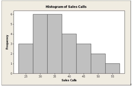
The number of weekly sales calls by a sample of 25 pharmaceutical salespersons is below.
24, 56, 43, 35, 37, 27, 29, 44, 34, 28, 33, 28, 46, 31, 38, 41, 48, 38, 27, 29, 37, 33, 31, 40, 50
Construct a histogram.
Free
(Short Answer)
4.8/5  (22)
(22)
Correct Answer: Verified
 Construct a frequency table. You can use five to seven classes, depending on your choice and calculation of length as a whole integer.
 While the frequency table and histogram shown above are technically valid, it is unlikely that a student would create them based on the instructions in the textbook. A more likely frequency table a student might create would be:
 A histogram could easily be derived from this frequency table.
Which of the following is the best analytic dashboard graphical method for visualizing hierarchical information?
Free
(Multiple Choice)
4.8/5 (29)
Correct Answer:Verified
C
A company collected the ages from a random sample of its middle managers, with the resulting frequency distribution shown below.  What would be the approximate shape of the relative frequency histogram?
Free
(Multiple Choice)
4.9/5 (34)
Correct Answer:Verified
D
In a Pareto chart, the bar for the "Other" category should be placed to the far left of the chart.
(True/False)
4.7/5 (30)
A company collected the ages from a random sample of its middle managers, with the resulting frequency distribution shown below.  What is the relative frequency for the class with the greatest frequency?
(Multiple Choice)
4.8/5 (36)
A company's Chief Operating Officer (COO) keeps track of the mileage on her trips from her office at corporate headquarters to the company's off-site manufacturing facility and its nearby suppliers. The stem-and-leaf display of the data for one year is below.  In developing a histogram of these data, how many classes would be used?
(Multiple Choice)
4.7/5 (32)
At the end of their final exam, 550 students answered an additional question in which they rated their instructor's teaching effectiveness, with the following results.  What proportion of the students who rated their instructor as very or somewhat effective received a C or lower in the class?
(Multiple Choice)
4.8/5 (30)
Which one of the following graphical tools is used with quantitative data?
(Multiple Choice)
4.8/5 (32)
At the end of their final exam, 550 students answered an additional question in which they rated their instructor's teaching effectiveness, with the following results.  What proportion of the students who rated their instructor as very or somewhat effective received a B or better in the class?
(Multiple Choice)
4.8/5 (26)
If there are 30 values in a data set, how many classes should be created for a frequency histogram?
(Multiple Choice)
4.8/5 (33)
822 recently purchased books were randomly selected from all recent book purchases over the Internet. The chart below shows the breakdown of the classification of the book type. 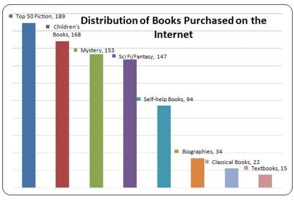 What percentage of the books in the sample were either mystery or science fiction/fantasy?
(Multiple Choice)
4.8/5 (39)
If there are 62 values in a data set, how many classes should be created for a frequency histogram?
(Multiple Choice)
4.8/5 (32)
A company's Chief Operating Officer (COO) keeps track of the mileage on her trips from her office at corporate headquarters to the company's off-site manufacturing facility and its nearby suppliers. The stem-and-leaf display of the data for one year is below.  What would be the class length for creating the frequency histogram?
(Multiple Choice)
4.7/5 (31)
The following is a relative frequency distribution of grades in an introductory statistics course.
 If we wish to depict these data using a pie chart, find how many degrees (out of 360 degrees) should be assigned to each grade.
(Short Answer)
4.8/5 (29)
The following data consist of the number of sick days taken by the 100 employees at a small manufacturing company for the past 18 months. Construct a dot plot of these data and describe the distribution.
5, 1, 4, 8, 0, 6, 3, 5, 3, 4, 7, 15, 5, 8, 2, 1, 5, 4
(Short Answer)
4.8/5 (29)
A graphical portrayal of a quantitative data set that divides the data into classes and gives the frequency of each class is a(n) ________.
(Multiple Choice)
4.7/5 (37)
An example of manipulating a graphical display to distort reality is ________.
(Multiple Choice)
4.9/5 (49)
Leaves on a stem-and-leaf display should be rearranged so that they are in increasing order from left to right.
(True/False)
4.9/5 (29)
Filters
- Essay(0)
- Multiple Choice(0)
- Short Answer(0)
- True False(0)
- Matching(0)