Deck 10: Graphs, Good and Bad
Full screen (f)
Question
Question
Question
Question
Question
Question
Question
Question
Question
Question
Question
Question
Question
Here is a table of the undergraduate enrollment at a large state university, broken down by class:
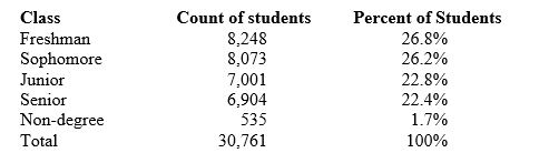
The percentage of students in the five classifications should add to 100%. In fact, they add to only 99.9%. The reason is that
A) there must be an arithmetic mistake.
B) the percents are not exact, because they are rounded to one decimal place.
C) some students must be left out, so the total should be less than 100%.
D) this is an example of a biased measurement.
Question
Question
Question
Question
Question
Here is a table of the undergraduate enrollment at a large state university, broken down by class:
To make a correct graph of the distribution of students by class, you could use a
A) bar graph.
B) pie chart.
C) line graph.
D) Answers bar graph, pie chart, and line graph are correct.
E) Both bar graph and pie chart are correct.
To make a correct graph of the distribution of students by class, you could use a
A) bar graph.
B) pie chart.
C) line graph.
D) Answers bar graph, pie chart, and line graph are correct.
E) Both bar graph and pie chart are correct.
Question
Question
Question
Question
Question
Question
Question
Question
Question
Question
Question
Question

Unlock Deck
Sign up to unlock the cards in this deck!
Unlock Deck
Unlock Deck
1/30
Play
Full screen (f)
Deck 10: Graphs, Good and Bad
1
A common abuse of bar graphs is to
A) use bars of equal width so that we can't see differences among the bars.
B) replace bars by pictures and increase both height and width as the variable plotted increases.
C) use bars that don't touch each other.
D) draw the bars vertically rather than horizontally.
E) stretch or squeeze the scale at the base of the bars so that our eyes are misled.
replace bars by pictures and increase both height and width as the variable plotted increases.
2
You are planning an experiment to determine the effect of the brand of gasoline and the weight of a car on gas mileage measured in miles per gallon. You will use a single test car, adding weights so that its total weight is 3000, 3500, or 4000 pounds. The car will drive on a test track at each weight using each of Exxon, Sunoco, and Texaco gasoline.
In this study, gasoline brand is a(n)
A) response variable.
B) explanatory variable.
C) lurking variable.
D) quantitative variable.
In this study, gasoline brand is a(n)
A) response variable.
B) explanatory variable.
C) lurking variable.
D) quantitative variable.
explanatory variable.
3
In order to be correct, a line graph of the number of suicides per year in the United States must have
A) number of suicides on the horizontal scale.
B) years on the horizontal scale.
C) either suicides or years on the horizontal scale, as long as equal intervals are used.
D) bars of equal width.
A) number of suicides on the horizontal scale.
B) years on the horizontal scale.
C) either suicides or years on the horizontal scale, as long as equal intervals are used.
D) bars of equal width.
years on the horizontal scale.
4
Using data on the average national cost of regular grade gasoline by month since 2006, to show clearly how the cost of gasoline has changed over time, the best choice of graph is a:
A) bar graph.
B) line graph.
C) pie chart.
D) histogram.
E) scatterplot.
A) bar graph.
B) line graph.
C) pie chart.
D) histogram.
E) scatterplot.
Unlock Deck
Unlock for access to all 30 flashcards in this deck.
Unlock Deck
k this deck
5
An example of a categorical variable is the
A) number of songs on my MP3 player.
B) title of a song on my MP3 player.
C) duration of a song (in seconds) on my MP3 player.
D) composer of a song on my MP3 player.
E) Both title of a song on my MP3 player and composer of a song on my MP3 player are correct.
A) number of songs on my MP3 player.
B) title of a song on my MP3 player.
C) duration of a song (in seconds) on my MP3 player.
D) composer of a song on my MP3 player.
E) Both title of a song on my MP3 player and composer of a song on my MP3 player are correct.
Unlock Deck
Unlock for access to all 30 flashcards in this deck.
Unlock Deck
k this deck
6
A bar graph compares the size of the armed forces for China, North Korea, Russia, and the United States. To make the graph look nicer, the artist replaces each bar by a proportionally correct picture of a soldier that is enlarged or reduced to be as tall as the bar. This graph is misleading because
A) it's the wrong kind of graph. Use a pie chart instead.
B) it's the wrong kind of graph. Use a scatterplot instead.
C) China's armed forces are twice as large as those of North Korea, but the choice of vertical scale can change this to half as large or four times as large.
D) China's armed forces are twice as large as those of North Korea, but the area of China's soldier picture is four times as large as the North Korea picture.
Unlock Deck
Unlock for access to all 30 flashcards in this deck.
Unlock Deck
k this deck
7
If a bar graph is to be accurate, it is essential that
A) the bars touch each other.
B) the bars be drawn vertically.
C) both horizontal and vertical scales be clearly marked in equal units.
D) the bars all have the same width.
E) the explanatory variable be plotted on the horizontal axis.
A) the bars touch each other.
B) the bars be drawn vertically.
C) both horizontal and vertical scales be clearly marked in equal units.
D) the bars all have the same width.
E) the explanatory variable be plotted on the horizontal axis.
Unlock Deck
Unlock for access to all 30 flashcards in this deck.
Unlock Deck
k this deck
8
A company database contains the following information about each employee: age, date hired, sex (male or female), ethnic group (Asian, black, Hispanic, etc.), job category (clerical, management, technical, etc.), and yearly salary. Which of the following lists of variables are all categorical?
A) Age, sex, ethnic group
B) Sex, ethnic group, job category
C) Ethnic group, job category, yearly salary
D) Yearly salary, age
E) Age, date hired
A) Age, sex, ethnic group
B) Sex, ethnic group, job category
C) Ethnic group, job category, yearly salary
D) Yearly salary, age
E) Age, date hired
Unlock Deck
Unlock for access to all 30 flashcards in this deck.
Unlock Deck
k this deck
9
You are planning an experiment to determine the effect of the brand of gasoline and the weight of a car on gas mileage measured in miles per gallon. You will use a single test car, adding weights so that its total weight is 3000, 3500, or 4000 pounds. The car will drive on a test track at each weight using each of Exxon, Sunoco, and Texaco gasoline.
In this study,
A) gasoline brand is a categorical variable and weight is a quantitative variable.
B) gasoline brand and weight are both categorical variables.
C) gasoline brand and weight are both quantitative variables.
D) gasoline brand is a quantitative variable and weight is a categorical variable.
Unlock Deck
Unlock for access to all 30 flashcards in this deck.
Unlock Deck
k this deck
10
Were the extinctions that occurred in the last ice age more frequent among species of animals with large body sizes? A researcher gathers data on the average body mass (in kilograms) of all species known to have existed at that time. These measurements are values of
A) a categorical variable.
B) a quantitative variable.
C) an invalid variable.
D) a margin of error.
A) a categorical variable.
B) a quantitative variable.
C) an invalid variable.
D) a margin of error.
Unlock Deck
Unlock for access to all 30 flashcards in this deck.
Unlock Deck
k this deck
11
Does using a cell phone while driving make an accident more likely? Researchers compared telephone company and police records to find 699 people who had cell phones and were also involved in an auto accident. Using billing records, they compared cell phone use in the period of the accident with cell phone use the same period on a previous day. Result: The risk of an accident was four times higher when using a cell phone.
The researchers also recorded the manufacturer of each subject's cell phone (Apple, Samsung, etc.). This variable is
A) categorical.
B) quantitative.
C) response.
D) not valid.
The researchers also recorded the manufacturer of each subject's cell phone (Apple, Samsung, etc.). This variable is
A) categorical.
B) quantitative.
C) response.
D) not valid.
Unlock Deck
Unlock for access to all 30 flashcards in this deck.
Unlock Deck
k this deck
12
Does using a cell phone while driving make an accident more likely? Researchers compared telephone company and police records to find 699 people who had cell phones and were also involved in an auto accident. Using billing records, they compared cell phone use in the period of the accident with cell phone use the same period on a previous day. Result: The risk of an accident was four times higher when using a cell phone.
The proper graph for showing the distribution of phones by manufacturer (i.e., number of people who own an Apple phone, number of people who own a Samsung phone, etc.) is a
A) line graph.
B) stemplot.
C) bar graph.
D) histogram.
E) phonograph.
The proper graph for showing the distribution of phones by manufacturer (i.e., number of people who own an Apple phone, number of people who own a Samsung phone, etc.) is a
A) line graph.
B) stemplot.
C) bar graph.
D) histogram.
E) phonograph.
Unlock Deck
Unlock for access to all 30 flashcards in this deck.
Unlock Deck
k this deck
13
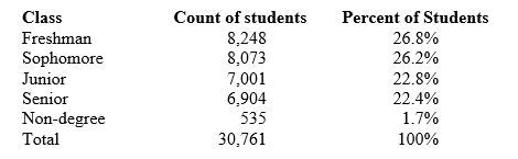
Here is a table of the undergraduate enrollment at a large state university, broken down by class:
The percentage of students in the five classifications should add to 100%. In fact, they add to only 99.9%. The reason is that
A) there must be an arithmetic mistake.
B) the percents are not exact, because they are rounded to one decimal place.
C) some students must be left out, so the total should be less than 100%.
D) this is an example of a biased measurement.
Unlock Deck
Unlock for access to all 30 flashcards in this deck.
Unlock Deck
k this deck
14
Is the level of belief in anthropogenic (human-caused) climate change of state legislators affected by that legislator's political affiliation? A researcher gathers data on level of belief (from 1 = absolutely disbelieve to 5 = absolutely believe) and political affiliation for 702 state legislators from across the country. These measurements are values of:
A) quantitative variables.
B) categorical variables.
C) quantitative (level of belief) and categorical (political affiliation) variables.
D) invalid variables.
A) quantitative variables.
B) categorical variables.
C) quantitative (level of belief) and categorical (political affiliation) variables.
D) invalid variables.
Unlock Deck
Unlock for access to all 30 flashcards in this deck.
Unlock Deck
k this deck
15
A line graph shows that the price of fresh oranges falls early in each year when the orange harvest in Florida is ready, then it rises late in the year when oranges from that year's harvest begin to run out. This is an example of
A) trend in a line graph.
B) erratic fluctuations in a line graph.
C) seasonal variation in a line graph.
D) confounding.
A) trend in a line graph.
B) erratic fluctuations in a line graph.
C) seasonal variation in a line graph.
D) confounding.
Unlock Deck
Unlock for access to all 30 flashcards in this deck.
Unlock Deck
k this deck
16
To illustrate a talk you are giving, you want to make a graph to compare the consumption (in gallons) of alcohol per person for several countries. For example, this is 2.87 gallons per person in France and 1.74 gallons per person in the United States. You should make a
A) bar graph.
B) histogram.
C) line graph.
D) pie chart.
A) bar graph.
B) histogram.
C) line graph.
D) pie chart.
Unlock Deck
Unlock for access to all 30 flashcards in this deck.
Unlock Deck
k this deck
17
Is the type of high school a person went to, public or private, a significant factor in predicting that person's future college grade point average (GPA)? A researcher gathers data on the type of high school and college GPA for 569 college seniors. These measurements are values of
A) quantitative variables.
B) categorical variables.
C) quantitative (SAT) and categorical (type of high school) variables.
D) invalid variables.
A) quantitative variables.
B) categorical variables.
C) quantitative (SAT) and categorical (type of high school) variables.
D) invalid variables.
Unlock Deck
Unlock for access to all 30 flashcards in this deck.
Unlock Deck
k this deck
18
Here is a table of the undergraduate enrollment at a large state university, broken down by class:
To make a correct graph of the distribution of students by class, you could use a
A) bar graph.
B) pie chart.
C) line graph.
D) Answers bar graph, pie chart, and line graph are correct.
E) Both bar graph and pie chart are correct.
To make a correct graph of the distribution of students by class, you could use a
A) bar graph.
B) pie chart.
C) line graph.
D) Answers bar graph, pie chart, and line graph are correct.
E) Both bar graph and pie chart are correct.
Unlock Deck
Unlock for access to all 30 flashcards in this deck.
Unlock Deck
k this deck
19
While an analyst considers the time plot of the closing value of the Dow Jones Industrial Average, he notices a trend. This means he sees:
A) a persistent long-term rise or fall.
B) due to nonresponse.
C) due to confounding.
D) a pattern in a time series that repeats itself at known regular intervals of time.
E) the margin of error.
A) a persistent long-term rise or fall.
B) due to nonresponse.
C) due to confounding.
D) a pattern in a time series that repeats itself at known regular intervals of time.
E) the margin of error.
Unlock Deck
Unlock for access to all 30 flashcards in this deck.
Unlock Deck
k this deck
20
The age, weight, imbiber status (drinker or nondrinker), level of education (high school graduate or not,) and earned income of a simple random sample of 1,463 people is measured. The number of variables measured is:
A) 1463-the size of the sample.
B) six-age, weight, imbiber status, level of education, income, and number of high school graduates.
C) five-age, weight, imbiber status, level of education, and income.
D) three-age, weight, and income. Imbiber status and level of education are not variables because they don't have units such as years or pounds.
Unlock Deck
Unlock for access to all 30 flashcards in this deck.
Unlock Deck
k this deck
21
To display the percent of residents at least 65 years old in each of the 50 states in 2011, a good choice of a graph would be a:
A) box score.
B) histogram.
C) line graph.
D) pie chart.
E) bar graph.
A) box score.
B) histogram.
C) line graph.
D) pie chart.
E) bar graph.
Unlock Deck
Unlock for access to all 30 flashcards in this deck.
Unlock Deck
k this deck
22
In a young woman's study group, 7 percent of the students are from the town where the young woman's school is located, 80 percent are from in-state (but not from the school's town), and the rest are from outside the state.
What percent of study group students is from outside the state?
A) 7 percent
B) 27 percent
C) 80 percent
D) 93 percent
E) 13 percent
What percent of study group students is from outside the state?
A) 7 percent
B) 27 percent
C) 80 percent
D) 93 percent
E) 13 percent
Unlock Deck
Unlock for access to all 30 flashcards in this deck.
Unlock Deck
k this deck
23
The proper graph for showing the percentage of students in a monogamous relationship, grouped by year in school (freshman, sophomore, etc.) is a
A) line graph.
B) stemplot.
C) histogram.
D) pie chart.
A) line graph.
B) stemplot.
C) histogram.
D) pie chart.
Unlock Deck
Unlock for access to all 30 flashcards in this deck.
Unlock Deck
k this deck
24
In order to create a good graph, you must do each of the following EXCEPT
A) clearly label the axes or provide a legend.
B) use three-dimensional effects, many colors, and eye-catching backgrounds.
C) avoid pictograms.
D) make the data stand out.
A) clearly label the axes or provide a legend.
B) use three-dimensional effects, many colors, and eye-catching backgrounds.
C) avoid pictograms.
D) make the data stand out.
Unlock Deck
Unlock for access to all 30 flashcards in this deck.
Unlock Deck
k this deck
25
In a young woman's study group, 7 percent of the students are from the town where the young woman's school is located, 80 percent are from in-state (but not from the school's town), and the rest are from outside the state.
The proper graph for showing distribution of students in the study group is a:
A) line graph.
B) stemplot.
C) histogram.
D) pie chart.
The proper graph for showing distribution of students in the study group is a:
A) line graph.
B) stemplot.
C) histogram.
D) pie chart.
Unlock Deck
Unlock for access to all 30 flashcards in this deck.
Unlock Deck
k this deck
26
What does "seasonal adjustment" mean?
A) Data are seasonally adjusted if we take out changes that occur in about the same size and same time every year.
B) Data are seasonally adjusted when we ignore the effects of one-time events such as strikes and hurricanes.
C) Data are seasonally adjusted if we report the average for this month over several past years, not just this one month's data.
D) Data are seasonally adjusted if we report the average for the past four months, not just this month's data.
Unlock Deck
Unlock for access to all 30 flashcards in this deck.
Unlock Deck
k this deck
27
When a line graph displays data after an expected persistent long-term rise or fall has been removed, it is said that the data have been:
A) seasonally adjusted.
B) variably adjusted.
C) deviation adjusted.
D) trend adjusted.
A) seasonally adjusted.
B) variably adjusted.
C) deviation adjusted.
D) trend adjusted.
Unlock Deck
Unlock for access to all 30 flashcards in this deck.
Unlock Deck
k this deck
28
In a young woman's study group, 7 percent of the students are from the town where the young woman's school is located, 80 percent are from in-state (but not from the school's town), and the rest are from outside the state.
What percent of study group students is not from the town in which the school is located?
A) 7 percent
B) 27 percent
C) 80 percent
D) 93 percent
E) 13 percent
What percent of study group students is not from the town in which the school is located?
A) 7 percent
B) 27 percent
C) 80 percent
D) 93 percent
E) 13 percent
Unlock Deck
Unlock for access to all 30 flashcards in this deck.
Unlock Deck
k this deck
29
When pictures replace the bars in a bar graph, the resulting graph is called a
A) histogram.
B) photograph.
C) picture plot.
D) hologram.
E) pictogram.
A) histogram.
B) photograph.
C) picture plot.
D) hologram.
E) pictogram.
Unlock Deck
Unlock for access to all 30 flashcards in this deck.
Unlock Deck
k this deck
30
A __________ tells us what values a variable takes and how often it takes those values.
A) distribution
B) quantity
C) seasonal variation
D) trend
A) distribution
B) quantity
C) seasonal variation
D) trend
Unlock Deck
Unlock for access to all 30 flashcards in this deck.
Unlock Deck
k this deck
Unlock Deck
Unlock for access to all 30 flashcards in this deck.


