Exam 32: Graphs in Economics
Exam 1: First Principles233 Questions
Exam 2: Economic Models- Trade-Offs and Trade313 Questions
Exam 3: Supply and Demand290 Questions
Exam 4: Consumer and Producer Surplus224 Questions
Exam 5: Price Controls and Quotas- Meddling With Markets201 Questions
Exam 6: Elasticity98 Questions
Exam 7: Taxes298 Questions
Exam 9: The Rational Consumer44 Questions
Exam 8: International Trade268 Questions
Exam 10: Decision Making by Individuals and Firms116 Questions
Exam 11: Perfect Competition and the Supply Curve355 Questions
Exam 12: Monopoly348 Questions
Exam 13: Oligopoly97 Questions
Exam 14: Monopolistic Competition and Product Differentiation124 Questions
Exam 15: Externalities140 Questions
Exam 16: Public Goods and Common Resources75 Questions
Exam 17: The Economics of the Welfare State91 Questions
Exam 18: Factor Markets and the Distribution of Income314 Questions
Exam 19: Uncertainty, Risk, and Private Information197 Questions
Exam 20: Macroeconomics- the Big Picture168 Questions
Exam 21: Gdp and the Consumer Price Index204 Questions
Exam 22: Unemployment and Inflation351 Questions
Exam 23: Long-Run Economic Growth313 Questions
Exam 24: Savings, Investment Spending398 Questions
Exam 25: Fiscal Policy376 Questions
Exam 26: Money, Banking, and the Federal Reserve System464 Questions
Exam 27: Monetary Policy359 Questions
Exam 28: Inflation, Disinflation, and Deflation240 Questions
Exam 29: Crises and Consequences214 Questions
Exam 30: Macroeconomics- Events and Ideas320 Questions
Exam 31: Open-Economy Macroeconomics466 Questions
Exam 32: Graphs in Economics64 Questions
Exam 33: Toward a Fuller Understanding36 Questions
Exam 34: Consumer Preferences and Consumer Choice62 Questions
Exam 35: Indifference Curve Analysis of Labor Supply41 Questions
Select questions type
Use the following to answer questions
Figure: Unemployment Rate over Time 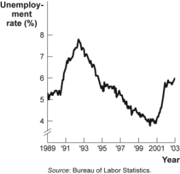 -(Figure: Unemployment Rate over Time) Look at the figure Unemployment Rate over Time. In the time-series graph, as we move from 1991 to 1993, we see that the unemployment rate has _____ from approximately _____ to approximately _____.
(Multiple Choice)
4.9/5  (35)
(35)
Use the following to answer questions
Figure: Labor Force Participation Rate 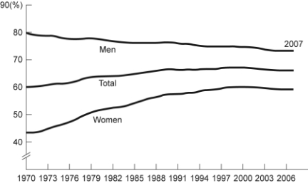 -(Figure: Labor Force Participation Rate) Look at the figure Labor Force Participation Rate. Using the figure, the labor force participation rate for women was ______ during 1970-1985 and ______ during 1998-2006.
(Multiple Choice)
4.8/5 (35)
Use the following to answer questions
Table: Wages and Hours Willing to Work 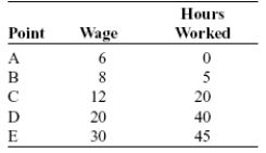 -(Table: Wages and Hours Willing to Work) Look at the table Wages and Hours Willing to Work. If it was graphed, the relationship between wage per hour and hours willing to work would be:
(Multiple Choice)
4.8/5 (37)
Use the following to answer questions
Figure: Demand and Supply of Shirts  -(Figure: Demand and Supply of Shirts) Look at the figure Demand and Supply of Shirts. In the graph, if the line labeled D shows how many shirts per week will be demanded at various prices, then it is clear that as the price of shirts falls:
(Multiple Choice)
4.7/5 (31)
Use the following to answer questions
Figure: Cold Drinks Sold and Temperature 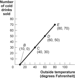 -(Figure: Cold Drinks Sold and Temperature) Look at the figure Cold Drinks Sold and Temperature. If we move from point C to point D in the figure, the outside temperature has ______ degrees and the number of cold drinks sold has ______.
(Multiple Choice)
4.9/5 (33)
Use the following to answer questions
Figure: Seasonally Adjusted Unemployment Rate 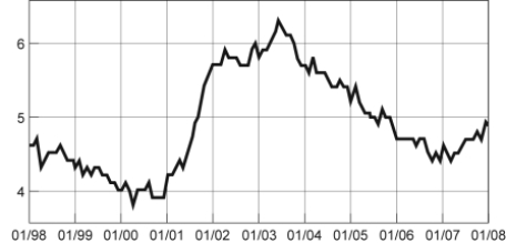 -(Figure: Seasonally Adjusted Unemployment Rate) Look at the figure Seasonally Adjusted Unemployment Rate. The distance between each labeled point on the horizontal axis is one year. Unemployment was ______ between 1/2001 and 1/2003 and ______ between 1/2007 and 1/2008.
(Multiple Choice)
4.8/5 (42)
An economist wishes to build a model to explain the relationship between the number of diamonds purchased every year and the average income of consumers in that year. Which variable should be the dependent variable and which should be the independent variable? All else equal, do you expect this relationship to be positive or negative? Explain.
(Essay)
4.7/5 (37)
Use the following to answer questions
Figure: Slope 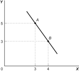 -(Figure: Slope) Look at the figure Slope. In the graph, the slope of the line between points A and B is:
(Multiple Choice)
4.9/5 (38)
Use the following to answer questions
Figure: Hot Drinks Sold and Temperature 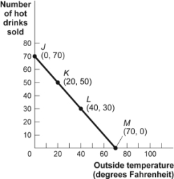 -(Figure: Hot Drinks Sold and Temperature) Look at the figure Hot Drinks Sold and Temperature. If we move from point L to point M in the figure, the outside temperature has ______ degrees and the number of hot drinks sold has ______.
(Multiple Choice)
4.7/5 (29)
Use the following to answer questions
Figure: Unemployment Rate over Time
-(Figure: Unemployment Rate over Time) Look at the figure Unemployment Rate over Time. In the time-series graph, as we move from 1993 to 1995, we see that the unemployment rate has _____ from approximately _____ to approximately _____.
(Multiple Choice)
4.9/5 (33)
A positive relationship between swimsuits purchased and ice cream purchased could be the result of:
(Multiple Choice)
4.9/5 (36)
Use the following to answer questions
Figure: Consumption of Pizza and Tacos 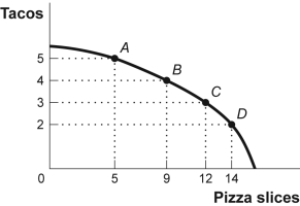 -(Figure: Consumption of Pizza and Tacos) Look at the figure Consumption of Pizza and Tacos. The figure shows the number of tacos and pizza slices Matt can eat in a day. The relation is nonlinear, and there is a negative relation between the number of tacos and pizza slices that Matt can eat in a day.
(True/False)
4.7/5 (27)
Use the following to answer questions
Figure: Consumption of Pizza and Tacos
-(Figure: Consumption of Pizza and Tacos) Look at the figure Consumption of Pizza and Tacos. The figure shows the number of tacos and pizza slices Matt can eat in a day. The best estimate of the slope between point A and point B is -4.
(True/False)
4.7/5 (40)
Use the following to answer questions
Figure: Good X and Good Y 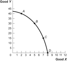 -(Figure: Good X and Good Y) Look at the figure Good X and Good Y. If we move from point C to point B in the figure, the x-variable has ______ units and the y-variable has ______ units.
(Multiple Choice)
4.8/5 (40)
Use the following to answer questions
Figure: Cold Drinks Sold and Temperature
-(Figure: Cold Drinks Sold and Temperature) Look at the figure Cold Drinks Sold and Temperature. If we move from point B to point C in the figure, the outside temperature has ______ degrees and the number of cold drinks sold has ______.
(Multiple Choice)
4.9/5 (40)
Taylor sees a bar graph showing the average weight of adult males over the past 200 years and concludes that men get more obese over time. Taylor's conclusion may be wrong, since she did not consider:
(Multiple Choice)
4.9/5 (45)
Use the following to answer questions
Table: Wages and Hours Willing to Work
-(Table: Wages and Hours Willing to Work) Look at the table Wages and Hours Willing to Work, which shows data on wage per hour and the number of hours someone is willing to work. Which variable would economists put on the vertical axis?
(Multiple Choice)
4.8/5 (42)
Use the following to answer questions
Figure: Seasonally Adjusted Unemployment Rate
-(Figure: Seasonally Adjusted Unemployment Rate) Look at the figure Seasonally Adjusted Unemployment Rate. The distance between each labeled point on the horizontal axis is one year. Unemployment was ______ between 1/2001 and 1/2002 and ______ between 1/1999 and 1/2000.
(Multiple Choice)
4.9/5 (42)
Filters
- Essay(0)
- Multiple Choice(0)
- Short Answer(0)
- True False(0)
- Matching(0)