Essay
The table below shows the inflation rate for the period 2005 through 2010. Suppose you wanted to show that there was not much variation in the inflation rate over this period. How would you represent this table in a graph? Suppose you wanted to show that there was a large amount of variation during this period. How would you represent this table in a graph? 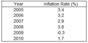
Correct Answer:

Verified
The figure below is drawn such that the ...View Answer
Unlock this answer now
Get Access to more Verified Answers free of charge
Correct Answer:
Verified
View Answer
Unlock this answer now
Get Access to more Verified Answers free of charge
Q14: Exhibit 2A-5<br> <img src="https://d2lvgg3v3hfg70.cloudfront.net/TB6906/.jpg" alt="Exhibit 2A-5
Q22: Consider a ratio for the total number
Q23: Refer to the table below. Analyze the
Q26: Graph the relationship between X and Y
Q29: Explain the purpose of each of the
Q44: Exhibit 2A-8 <img src="https://d2lvgg3v3hfg70.cloudfront.net/TB6906/.jpg" alt="Exhibit 2A-8
Q49: An inverse relationship between two variables indicates
Q60: Exhibit 2A-5<br> <img src="https://d2lvgg3v3hfg70.cloudfront.net/TB6906/.jpg" alt="Exhibit 2A-5
Q91: A positive relationship represents a situation where
Q121: Consider a straight line with a slope