Multiple Choice
The following graph shows pepper prices throughout a 12-month period. 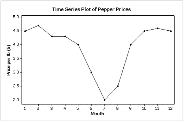 Suppose you made a new graph of the same data,where the maximum value on the Y-axis was changed from 5.0 to 10.0.(Assume everything else stays the same. ) Your new graph would appear to have ____ variability in pepper prices compared to the original graph shown above.
A) more
B) less
C) the same
D) unknown
Correct Answer:

Verified
Correct Answer:
Verified
Q22: When two variables tend to move in
Q27: A modal class is the class with
Q62: Differences in the frequencies of a histogram
Q88: Briefly discuss the difference between cross-sectional data
Q110: Briefly explain the difference between correlation and
Q111: Time-series data are often graphically depicted how?<br>A)Bar
Q114: {Teachers Ages Narrative} Draw a frequency histogram
Q157: What values are displayed on a cumulative
Q166: The first scatter diagram below shows a
Q167: Compare the two histograms below.Which statement is