Multiple Choice
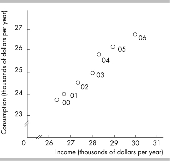
-In the above figure, the axis breaks are used
A) to create a misleading graph.
B) to show that there are no data available for the omitted ranges.
C) to indicate that there are jumps from the origin, 0, to the first values recorded along the axes.
D) to indicate that there are not enough data to be included in the graph.
Correct Answer:

Verified
Correct Answer:
Verified
Q292: An analyst on a local news channel
Q377: Scarcity is experienced by<br>A) only the poor.<br>B)
Q378: On the horizontal axis of a graph,
Q379: Opportunity cost is best defined as<br>A) how
Q380: <img src="https://d2lvgg3v3hfg70.cloudfront.net/TB5270/.jpg" alt=" -The figure above
Q381: The fact that a rock star earns
Q384: An autoworker is an example of _
Q387: "As the price of gasoline increases, fewer
Q390: "It is impossible to represent a three
Q441: The slope of a straight line increases