Multiple Choice
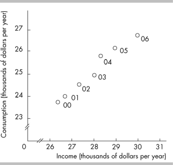
-In the above figure, the axis breaks are used
A) to indicate that there are not enough data to be included in the graph.
B) to show that there are no data available for the omitted ranges.
C) to create a misleading graph.
D) to indicate that there are jumps from the origin, 0, to the first values recorded along the axes.
Correct Answer:

Verified
Correct Answer:
Verified
Q197: If the slope of a line that
Q198: On a graph, high correlation between the
Q199: A benefit from an increase in activity
Q200: <img src="https://d2lvgg3v3hfg70.cloudfront.net/TB6802/.jpg" alt=" -The slope of
Q201: On a graph showing the relationship between
Q203: <img src="https://d2lvgg3v3hfg70.cloudfront.net/TB6802/.jpg" alt=" -The slope of
Q205: A store remains open from 8 a.m.
Q206: <img src="https://d2lvgg3v3hfg70.cloudfront.net/TB6802/.jpg" alt=" -In the above
Q207: <img src="https://d2lvgg3v3hfg70.cloudfront.net/TB6802/.jpg" alt=" -Which of the
Q233: <img src="https://d2lvgg3v3hfg70.cloudfront.net/TB8586/.jpg" alt=" -In the figure