Multiple Choice
What does the data in the chart demonstrate? 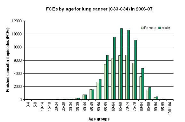
A) The incidence of cancer is highest among women aged 55-59.
B) The incidence of childhood cancer is highest in girls.
C) Cancer affects everyone.
D) A higher incidence of cancer occurs in men across most age groups.
Correct Answer:

Verified
Correct Answer:
Verified
Related Questions