True/False
The first scatter diagram below shows a stronger linear relationship than the second scatter diagram.(Assume the scales on both scatter diagrams are the same.) 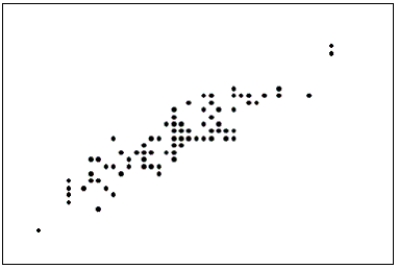
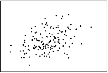
Correct Answer:

Verified
Correct Answer:
Verified
Related Questions
Q11: The number of class intervals in a
Q21: Observations that are measured at the same
Q29: You are less likely to be misled
Q32: Internet Classes<br>A survey of 25 students
Q46: A pie chart uses relative frequencies to
Q84: How do you determine whether two interval
Q118: The effect of making the slope of
Q133: It is speculated that the number of
Q134: Briefly explain why the histogram below is
Q143: Observations that are measured at successive points