Essay
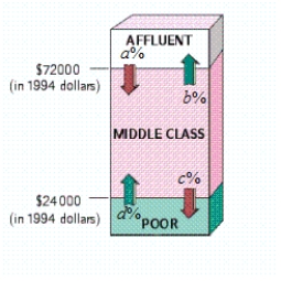
The following diagram shows the movement of U.S. households among three income groups - affluent, middle class, and poor - over the 11-year period 1982-1993.
 ? , , , ?
Use the transitions shown in the diagram to construct a transition matrix (assuming zero probabilities for the transitions between affluent and poor).
Take 1 = Affluent, 2 = Middle class, 3 = Poor.
Assuming that the trend shown was to continue, what percent of households classified as affluent in 1982 were predicted to become poor in 2004 (Give your answer to the nearest 0.1%.)
The answer is __________%
According to the model, what percentage of all U.S. households will be in each income bracket in the long term (Give your answers to the nearest 0.1 percent.)
Percent of affluent is __________%
Percent of middle class is __________%
Percent of poor is __________%
Correct Answer:

Verified
; 2.1; 18....View Answer
Unlock this answer now
Get Access to more Verified Answers free of charge
Correct Answer:
Verified
View Answer
Unlock this answer now
Get Access to more Verified Answers free of charge
Q1: You are choosing a region of
Q2: A dodecahedral die has 12 faces, numbered
Q3: You are given a transition matrix
Q4: In a (fictitious) soccer tournament involving
Q6: Student admissions are based on the
Q7: Describe the sample space S of
Q8: You are deciding on whether to enroll
Q9: Lance the Wizard has been informed that
Q10: Concerning Internet use In 1999, 59% of
Q11: The graph consists of a collection