Multiple Choice
The figure given below represents the effects in the labor markets due to migration. Here the world has been divided into a high-income "North" (left panel) and a low-income "South" (right panel) . Dn and Sn are the labor demand and the labor supply curves in North. Ds and (Sr + Smig) are the labor demand and pre-migration labor supply curves in South. Sr is the post-migration labor supply curve in South. The value c is the cost of migrating. 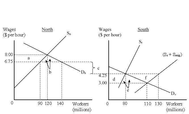 As a result of migration, the employers in North:
A) lose $131.25 million.
B) gain $31.25 million.
C) gain $162.5 million.
D) lose $100 million.
Correct Answer:

Verified
Correct Answer:
Verified
Q30: A firm that owns and controls operations
Q31: Most foreign direct investment is in:<br>A)the agricultural
Q32: Which of the following was among the
Q33: If movement of labor across countries is
Q34: In 2007-2011 China was the largest recipient
Q36: Historically, the U.S. firms have shown less
Q37: Political risk is the possibility that the
Q38: The figure given below represents the effects
Q39: The figure given below represents the effects
Q40: In the past three decades many developing