Multiple Choice
The figure given below represents the effects in the labor markets due to migration. Here the world has been divided into a high-income "North" (left panel) and a low-income "South" (right panel) . Dn and Sn are the labor demand and the labor supply curves in North. Ds and (Sr + Smig) are the labor demand and pre-migration labor supply curves in South. Sr is the post-migration labor supply curve in South. The value c is the cost of migrating. 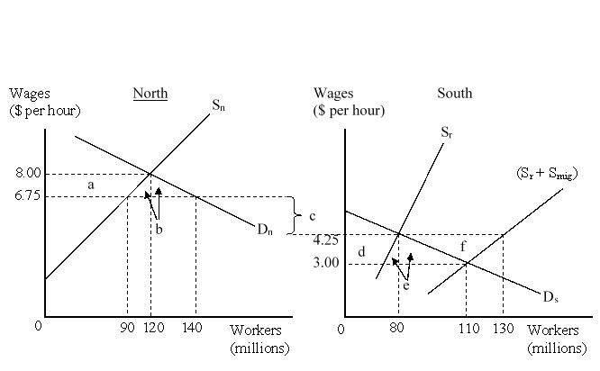 The migration cost on a per hour basis is:
A) $4.25.
B) $6.75.
C) $2.50.
D) $3.00.
Correct Answer:

Verified
Correct Answer:
Verified
Q34: In 2007-2011 China was the largest recipient
Q35: The figure given below represents the effects
Q36: Historically, the U.S. firms have shown less
Q37: Political risk is the possibility that the
Q38: The figure given below represents the effects
Q40: In the past three decades many developing
Q41: Which of the following groups are positively
Q42: Foreign Direct Investment (FDI) refers to:<br>A)the flow
Q43: The figure given below represents the effects
Q44: The figure given below represents the effects