Multiple Choice
The following chart shows the average number of hours commuters spend in traffic delays per year at the six most congested cities in the U.S.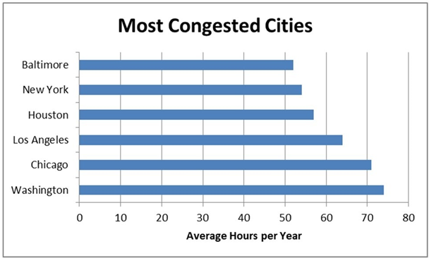
A) Houston commuters have a higher average number of hours spent per year in traffic delays when compared to New York commuters.
B) Chicago commuters have the highest average number of hours spent per year in traffic delays.
C) Baltimore commuters have the lowest average number of hours spent per year in traffic delays.
D) Los Angeles commuters have a lower average number of hours spent per year in traffic delays when compared to Washington commuters.
Correct Answer:

Verified
Correct Answer:
Verified
Q35: Each category of a pie chart occupies
Q36: ---------charts are a specific type of bar
Q37: The following graph shows the average grade
Q38: Histograms displaying discrete data usually have gaps
Q39: A------- is a graph showing the number
Q41: A data set has 60 observations with
Q42: ----------classes are classes with boundaries that do
Q43: A histogram is the appropriate type of
Q44: When creating a frequency distribution with grouped
Q45: If the class sizes are not equal